Add a watermark to a PDF in your browser, free, with no upload and no account. Stamp DRAFT across a proposal, CONFIDENTIAL across a report, a client’s name across a set of proofs — or your logo, tiled over the page or sitting quietly in a corner. The live preview renders your actual page with the actual stamp on it, so you can dial in the size and opacity before committing rather than saving three times to get it right.
Add Watermark to PDF Free: 3 Styles, Live Preview
How to add a watermark to a PDF in 3 steps
Step 1 — choose text or a logo. Drop in a PDF and type what the stamp should say — or switch to “Image or logo” and pick a PNG of your brand mark instead. The preview updates as you type, showing your real page with the real stamp, so a long phrase that will not fit is obvious immediately.
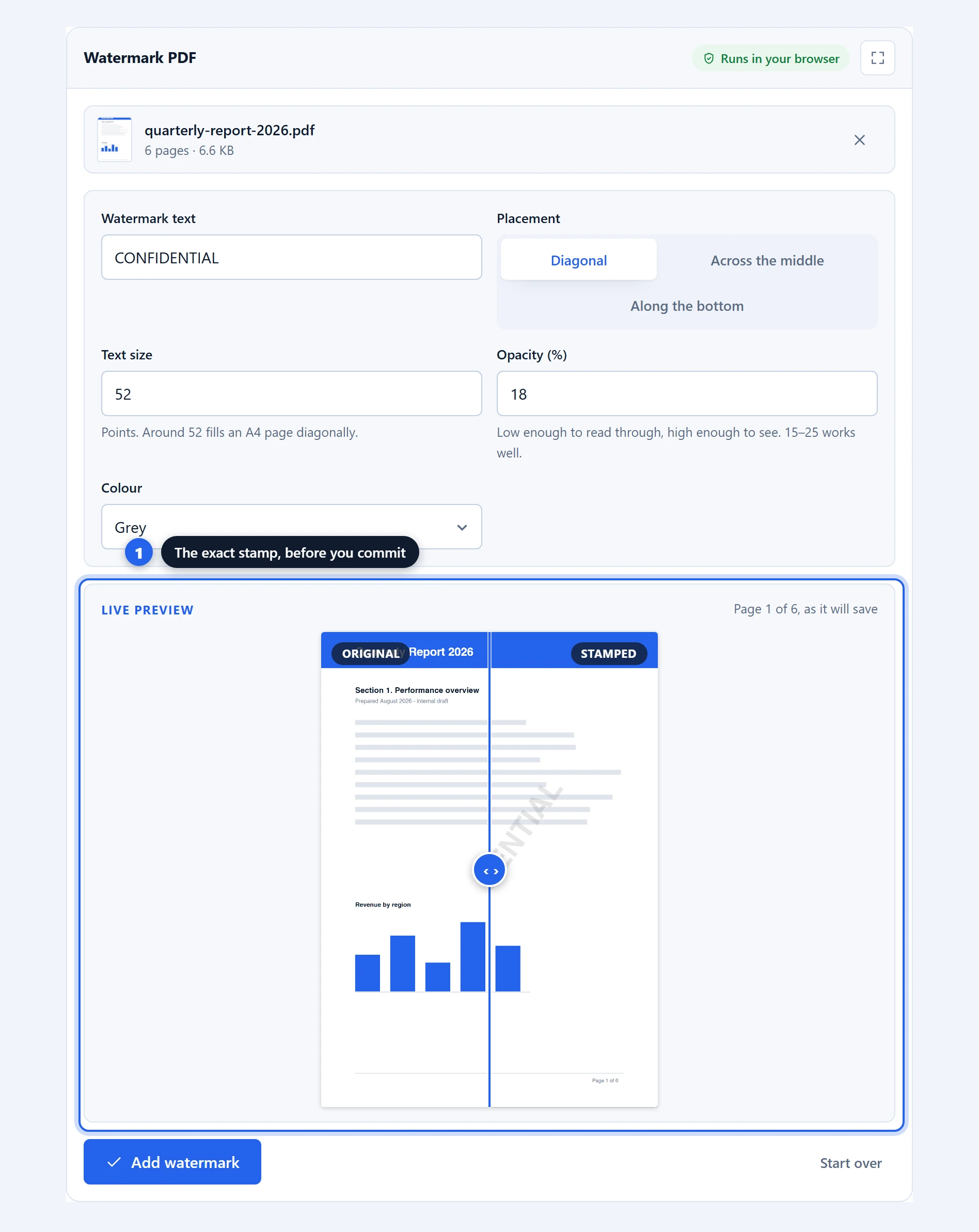
Step 2 — choose a placement and tune it. Diagonal, across the middle, tiled over the whole page, along the top or bottom, or pinned to any corner. Adjust the size, opacity and colour until it reads clearly without burying the document underneath.
Step 3 — apply and save. Click “Add watermark”. Every page is stamped and the file is ready.
The placements, and when each one fits
Diagonal is the classic. The text runs corner to corner across the page, which is the hardest placement to ignore and the hardest to crop out of a screenshot. It is the right choice for DRAFT, CONFIDENTIAL, SAMPLE or anything else that must not be mistaken for a final document. At the default size it fills an A4 page corner to corner.
Across the middle sits horizontally in the centre. It is more readable than the diagonal and less intrusive over dense text, which makes it a good fit for longer phrases like a company name or a case reference that someone actually needs to read.
Tiled repeats the stamp in a staggered grid over the whole page — the pattern you see on bank statements and sample documents. Nothing can be cropped around it, which makes it the strongest deterrent of the lot. Drop the text size to 20–30 first; tiles at heading size overwhelm the page.
Along the top or bottom are the discreet options: a header or footer line that marks the document without competing with its content. Use them for attribution, a licence note, or a recipient’s name on a shared copy — the kind of mark meant to be noticed on inspection rather than at a glance.
The corners pin the stamp to any of the four corners, out of the text’s way entirely. This is where a logo usually belongs: top-right or bottom-right at modest size marks every page without shouting on any of them.
Using a logo or image as the watermark
Switch the watermark from “Text” to “Image or logo” and pick a file. A PNG with a transparent background is the one to reach for: the mark floats over the page with nothing around it. A JPG works too, but brings its rectangular background with it — fine for a photo, wrong for a logo.
Size is set as a percentage of the page width, and opacity works exactly as it does for text — a logo at 15–25% opacity brands the page without fighting the content. The same placements apply, and two of them do most of the work: a corner at modest size for everyday branding, or tiled at low opacity for the sample-document look.
The image is embedded on your device like everything else here; a brand asset never leaves your machine.
Getting the opacity right
Opacity is the setting people get wrong most often, in both directions, so it is worth a moment.
Somewhere between 15% and 25% works for most documents. That is light enough to read the text underneath comfortably and heavy enough that the stamp is unmistakable. The default sits at 18%.
Below about 10% the watermark becomes decoration: visible on a screen, easy to miss in print, and useless as a signal. Above 40% it starts competing with the document, and on a dense page the result is genuinely hard to read. If you need something more emphatic, increasing the text size usually serves better than increasing the opacity.
Colour interacts with this. Grey at 20% is subtle; red at the same opacity reads considerably stronger, because the eye picks it out against black text. If red at 18% looks too aggressive, try grey at 22% before reaching for the opacity slider.
Why watermarking on your device is worth doing
Think about what people actually watermark. Draft contracts before they are agreed. Proofs going to a client. Internal reports marked confidential precisely because they should not circulate. Documents that are watermarked are, almost by definition, documents you are being careful with.
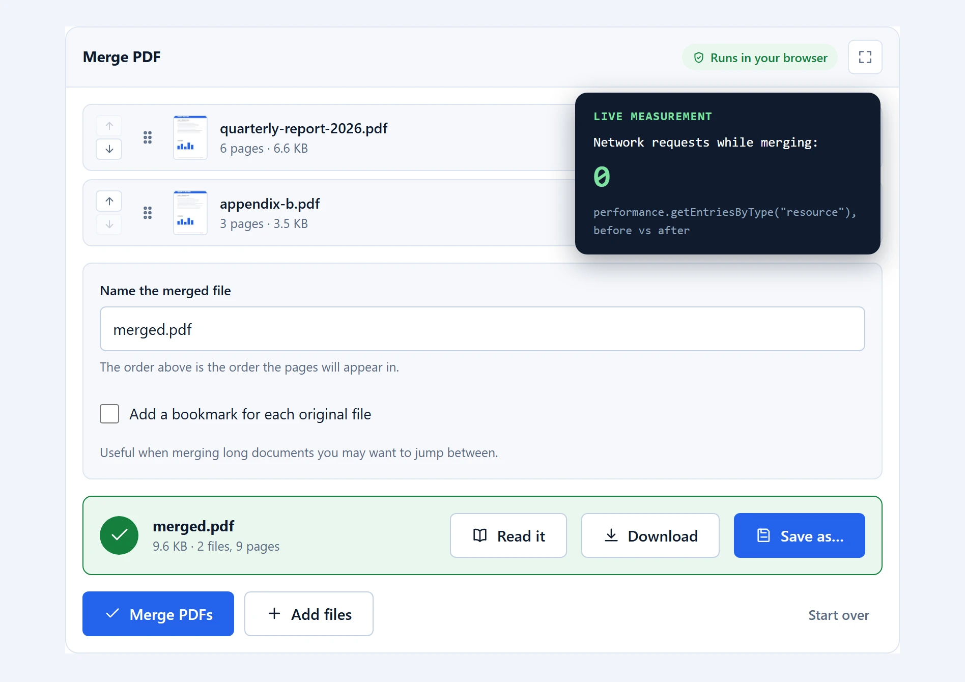
Uploading them to a stranger’s server to have “CONFIDENTIAL” written across them is an odd way to be careful. Here the file is read into memory by pdf-lib, the text is drawn onto each page, and the result comes straight back. Nothing is transmitted, and the live preview is generated by the same code path that writes the final file — so the preview cannot flatter the result.
What a watermark does and does not protect
Worth being straight about this, because watermarks are often mistaken for security.
A watermark is a label. It tells a reader the status of the document, deters casual redistribution, and makes a leaked copy awkward to pass off as official. Those are real benefits and they are usually the point.
It is not protection. The stamp sits over the content, so the underlying text is still there and still selectable and copyable. Someone determined can also remove a watermark with the right tools. If you need to prevent copying, that is encryption and permissions, not a watermark. If you need to hide information, that is redaction, which is a different job again and one we do not offer rather than offer badly.
Where it works well, and where it does not
Every page gets the same stamp. There is no way to watermark only some pages, or to vary the text per page. Split the document, watermark the part that needs it, and merge it back if you need that.
The stamp goes on top of the content, not behind it. This is a limitation of how the engine writes to a page, and we removed the “draw behind” option rather than ship a checkbox that did nothing. In practice on-top reads more clearly anyway; lowering the opacity gets you most of the way to the behind-the-text look.
Standard characters only. The built-in font covers the Latin alphabet, numbers and common punctuation. Text in Arabic, Chinese, Japanese, Korean, Cyrillic or Greek will not render correctly, because embedding those fonts would mean shipping a large font file to every visitor.
Password-protected files are refused. Unlock the document in your reader first.
Troubleshooting
The watermark runs off the edge. The text is too long or too large for the page. Reduce the size, or shorten the phrase — diagonal placement fits fewer characters than you would expect.
I can barely see it in the printed copy. Screens are more forgiving than paper. If the output is destined for print, raise the opacity by five or ten points above what looks right on screen.
The preview is empty. The text field is blank; the preview shows your page unstamped until there is something to stamp with.
Some characters came out wrong. Non-Latin scripts are not supported by the built-in font. Latin-alphabet text with accents works.
Frequently asked questions
Is this watermark tool free?
Yes. No account, no page limit, and no watermark of ours added to your output — which is more than some free watermark tools can say.
Is my document uploaded?
No. The file is read and stamped in your browser and never transmitted. You can confirm this in the network tab, or by using the tool offline after the page has loaded once.
What opacity should I use?
Between 15% and 25% suits most documents: readable through, clearly visible. Below 10% the stamp is easy to miss in print; above 40% it competes with the content. Raise it slightly if the file is destined for paper.
Can I watermark only some pages?
Not directly — the stamp is applied to every page. To watermark part of a document, split it first, watermark the section you need, then merge it back together.
Can a watermark be removed?
Yes, by someone with the right tools and motivation. A watermark labels a document and deters casual sharing; it is not a security control. For that you want encryption and permissions.
Does the watermark hide the text underneath?
No. It sits over the content but the underlying text remains selectable and copyable. If you need to hide information rather than label it, that is redaction, which is a different operation.
Can I use my company logo as a watermark?
Yes. Switch the watermark to “Image or logo” and pick the file — a PNG with a transparent background works best. Size, opacity and every placement work exactly as they do for text, and the logo is embedded on your device without being uploaded anywhere.
Why does my non-English text look wrong?
The built-in font covers the Latin alphabet, numbers and common punctuation. Scripts such as Arabic, Chinese, Japanese, Korean, Cyrillic and Greek would each need a separate embedded font, which would mean a large download for every visitor.
Related PDF tools
To mark a document as yours in a different way, sign PDF places a signature exactly where it belongs on the page. Add page numbers pairs well with a watermark on drafts. Everything is on the PDF tools page.