Grist tutorial: every dashboard block, explained
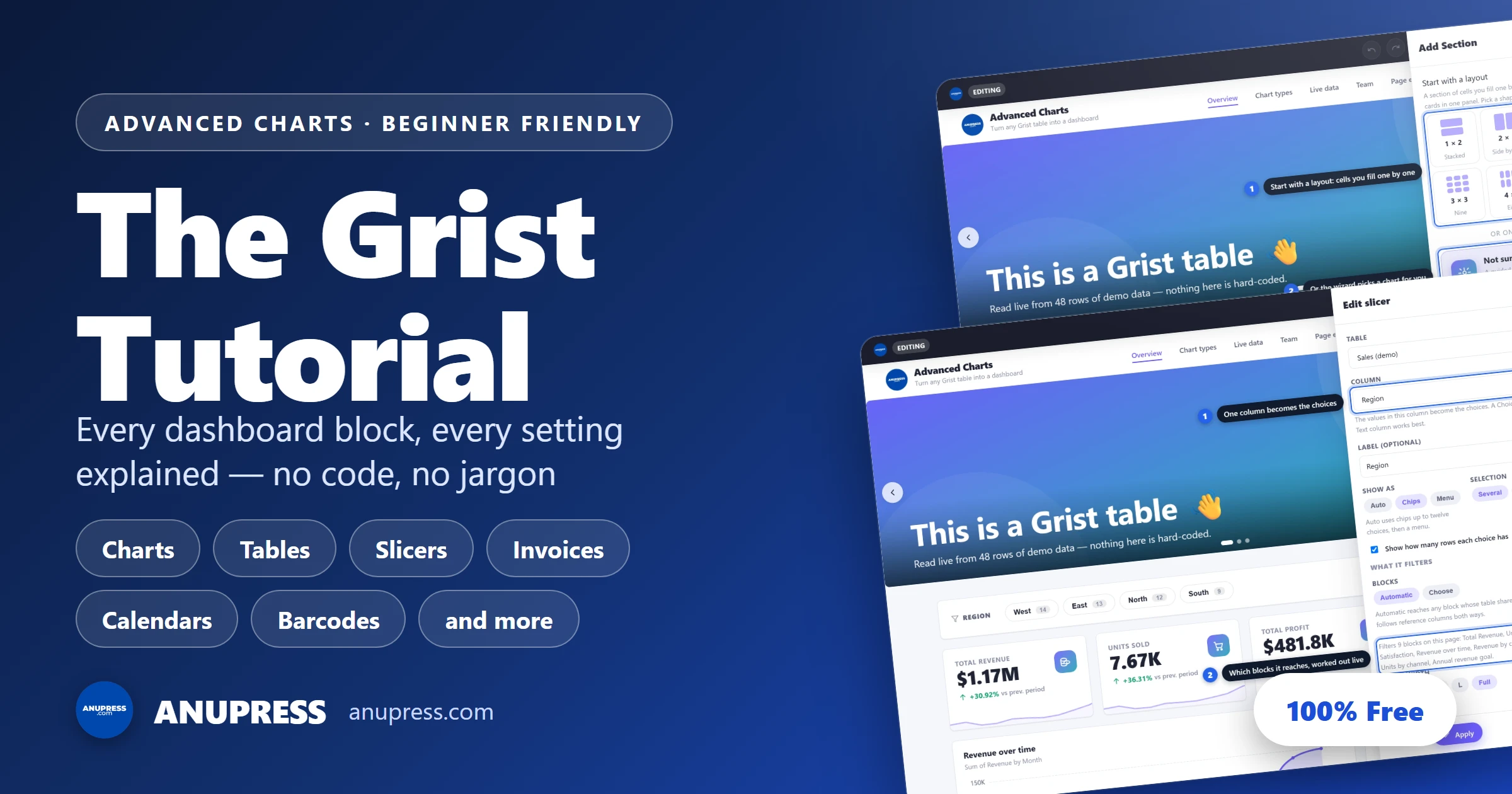
Advanced Charts gives a Grist table a whole shelf of building blocks, from KPI cards to invoices to a slicer that filters the page to barcodes that print at a real size. This Grist tutorial walks through every one of them: what each block does, every setting it has, and when you’d reach for it — written for someone who has never built a dashboard before.
Treat this Grist tutorial as a shelf reference rather than a straight read: the contents jump to any block, and each entry stands on its own. If you’d rather start from a finished design and work backwards, the ten starter templates are the faster door in.
The basics every block shares
Before the individual blocks, seven things work the same way everywhere. Learn these once and most of this Grist tutorial becomes obvious:
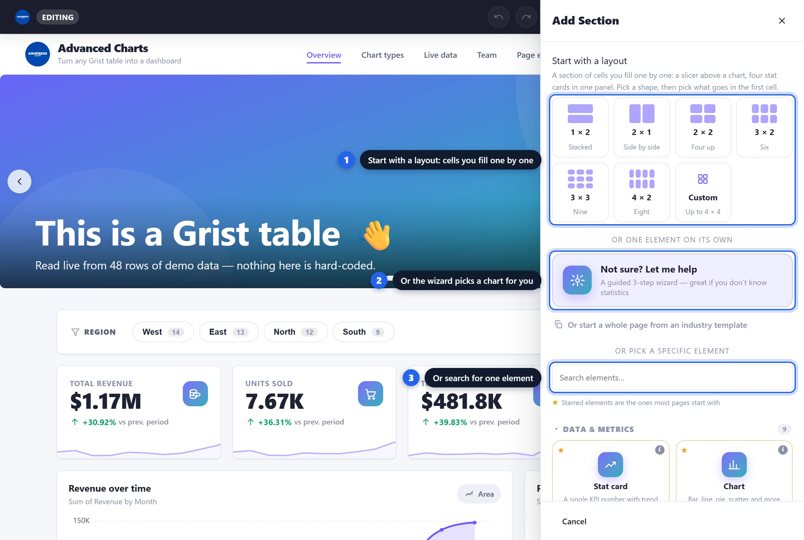
- Blocks are added from one panel. In edit mode, click the Add Section tile at the end of any page. The panel opens with a row of layouts (1×2, 2×1, 2×2, 3×2, 3×3, 4×2 or custom): pick one and a grid of cells lands on the page with the chooser open for its first cell. Below that is the single-element list, grouped into Data & Metrics, Content, Basic Elements and Advanced; a search box filters them, ★ marks the usual starting points, and the (i) on each tile explains it in a sentence.
- Every editor has a live preview. The block renders at the bottom of its settings panel and updates as you change things. Nothing lands on the page until you press Apply, and nothing is stored in your document until you press Save & Publish.
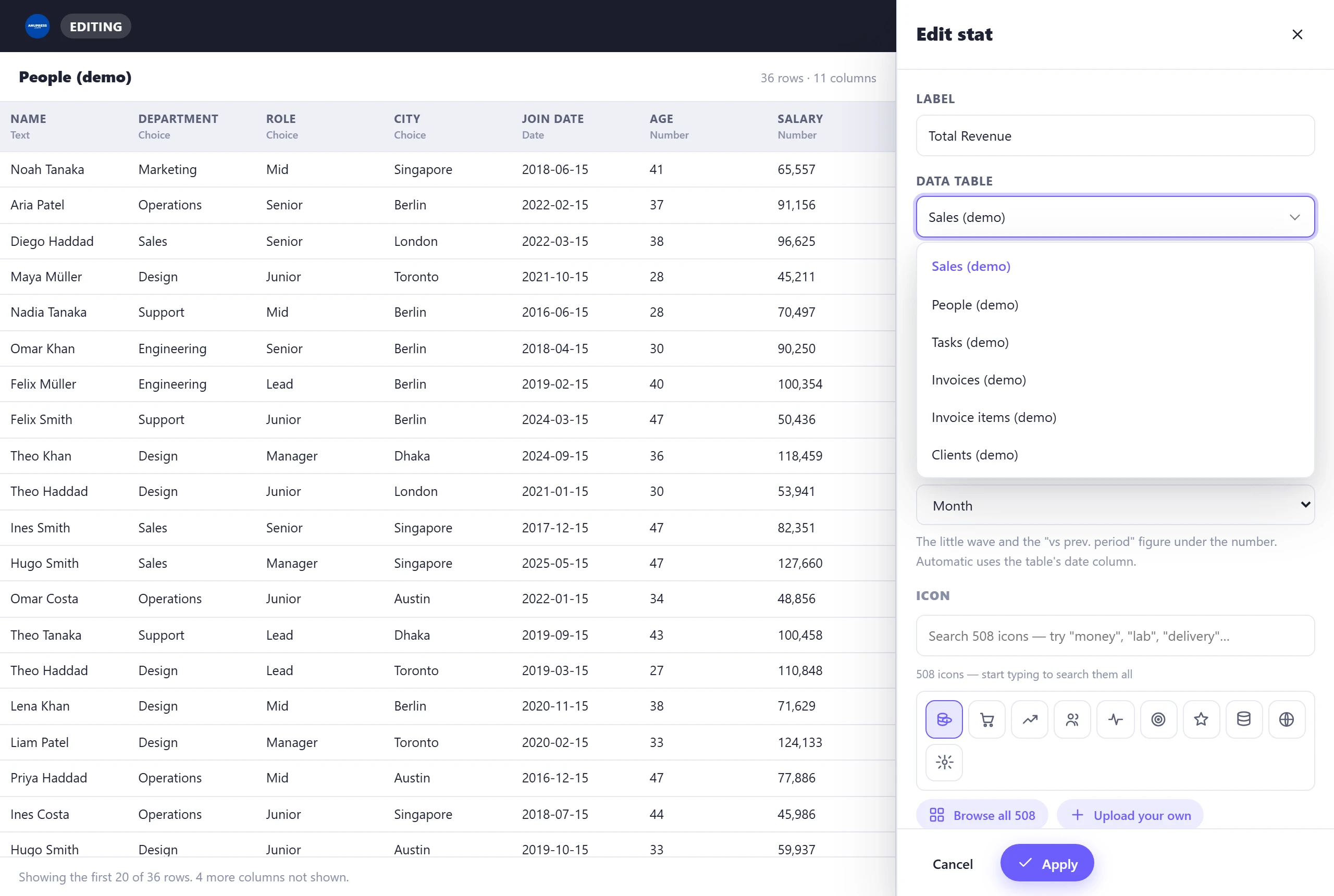
- Data blocks start with a table. Anything that reads your data has a Data table list naming every table in your document. Hover or arrow onto a table and the space beside the editor fills with it: its columns with their types and as many rows as fit, so “Members or People?” is settled by looking. Pick the table and the column dropdowns fill themselves from it. On a live document these editors also carry an “Edit the data in …” button for fixing a value without leaving the page.
- Every block has a width. The Block width row (XS · S · M · L · Full) decides how much of the row it takes. Four XS stat cards share a row; a Full chart takes its own. Phones ignore all of this and stack everything one column wide. Inside a Grid cell the row is greyed out, because the cell sets the width there; Column span under Layout & style takes over.
- Blocks are edited in place. Hover any block for drag, edit and delete buttons — or click the block itself to open its editor.
- Every change can be undone. The edit bar has undo and redo (Ctrl+Z and Ctrl+Y work too) and a History button that lists every step since you opened the editor, in plain words. Click a step to go back to it. The list lives while the editor is open and clears when you leave.
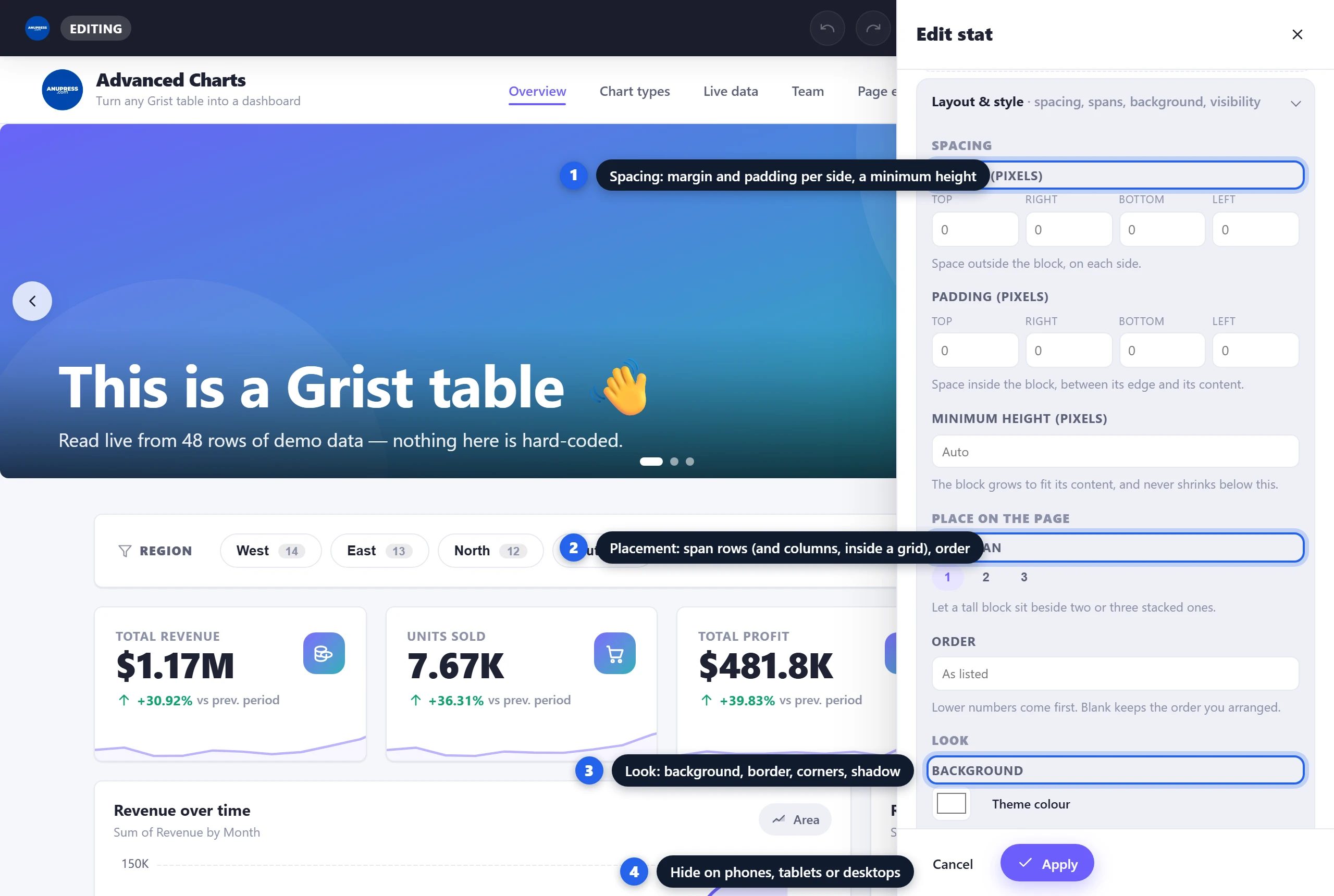
- Every block has a Layout & style section. It sits, closed, at the foot of every editor. Open it for margin and padding per side, a minimum height, a row span (column and row spans inside a grid, plus where the block sits in its cell), an order, a background, border, corner radius and shadow, hide-on-phones / tablets / desktops, and a CSS id, classes and z-index. It never touches the block’s own settings; Reset clears it, undo brings it back. While you edit, a block hidden on the current screen stays visible, faded and labelled.
Data & Metrics blocks
The blocks that read your tables. This part of the Grist tutorial is where most dashboards live.
1. Stat card — one number that matters
A big number computed from a column: total revenue, headcount, samples logged. Usually the first row of any dashboard, three or four of them side by side at XS width.
Pick a text column and the card switches to counting for you — “how many rows” is a perfectly good number. The trend is the small “+30.9% vs prev. period” line: it splits your rows by the trend column and compares the latest period against the one before.

2. Chart — eleven chart types in one block
Column, bar, line, area, pie, doughnut, treemap, funnel, radar, scatter and gauge, all inside one block. You choose data first and a chart type second — and types that don’t fit your selection grey out, so a nonsense chart is hard to build.
%count, %groups, %total) ·
Block width.If you’re unsure what any of that means, don’t configure a chart at all — the wizard exists so this part of the Grist tutorial can be skipped. Open Add Section → Not sure? Let me help. It asks which table, what to compare, and what number to show, then recommends the chart and adds it. Funnels have one extra trick — they can be built stage by stage from separate columns, which keeps them honest when your data isn’t already cumulative.

3. Breakdown — “how many of each?”
Counts each distinct value in a column and shows the split with coloured dots, counts and percentages. Empty cells get their own row, which quietly makes it a data-quality check too.
%total, %groups, %top, %topcount,
%empty) · Block width.4. Map — rows with coordinates, pinned
Every row with a latitude and longitude becomes a pin on an interactive Leaflet map, with clustering when pins crowd together and Street / Satellite / Terrain layers built in.
sample_latitude, or picked) · Popup title · Color points by (optional category
with a legend) · up to 4 tooltip fields · an optional extra tile layer (Tile URL, layer name, max zoom,
attribution) for teams with their own map server · Subtitle placeholders (%count,
%missing, %total) · Block width.5. Progress bar — a number against a goal
“$1.17M of $3M — 39%.” One fill bar, endlessly useful for fundraising totals, sales targets and SLAs.
6. Data table — the actual rows
Sometimes people don’t want a summary, they want the list. This block shows a table’s rows with live search, click-to-sort headings and paging.
G1:G48 that tint cells, e.g. a profit
column or a promotion zone · Block width.Reference columns show the name they point at, not the row number, and search and sorting use that name. Reference lists and choice lists come out as readable text, attachments as a file count. It also prints properly: the print button renders every row as a clean report with your site’s branding, not a screenshot with a pager in it.

7. Invoice — a row becomes a document
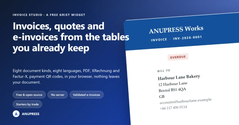
Pick a row from an invoices table and it renders as a finished, printable document: your logo and details, the client’s address, line items, totals. It has the most settings of any block in this Grist tutorial because it replaces a whole app, but the editor guesses most of them from your column names the moment you pick the table.
The document — Block title · Word on the document (type “Invoice”, “Receipt” or “Quote” — it’s free text) · Style (four mastheads: Classic, Banded, Letterhead, Minimal).
Where the invoices are — Invoice table · Invoice number · Client · Issue date · Due date · Amount · Status · Note · Their reference / PO and its label.
Line items — either a single Amount with a one-line description, or a separate line-items table (linked back by an invoice column) with Description, Quantity, Unit price and an optional Line total.
Client address book — a clients table, its Name column and Address lines.
Your details — Business name, Address, Email, Phone, Tax ID and its label, Logo.
Money & text — Currency symbol · Accent colour · Tax label and rate · Payment terms · Payment details · Prepared by · Closing message · Total label · Block width.
The block’s print button prints only the invoice — the rest of the page is left out — and “Save as PDF” in the print dialog turns it into a file you can send.

8. Calendar — anything with a date
Rows plotted on a month view. On a live document it’s two-way: drag an event to a new day and the date is written back to your table as one undoable change, and edits made in Grist appear on the calendar by themselves.
Dates respect the column’s own timezone, so nothing drifts a day when a dashboard is opened from another continent. Busy days collapse into a “+N more” link rather than stretching the whole month.

9. Slicer — let readers filter the page
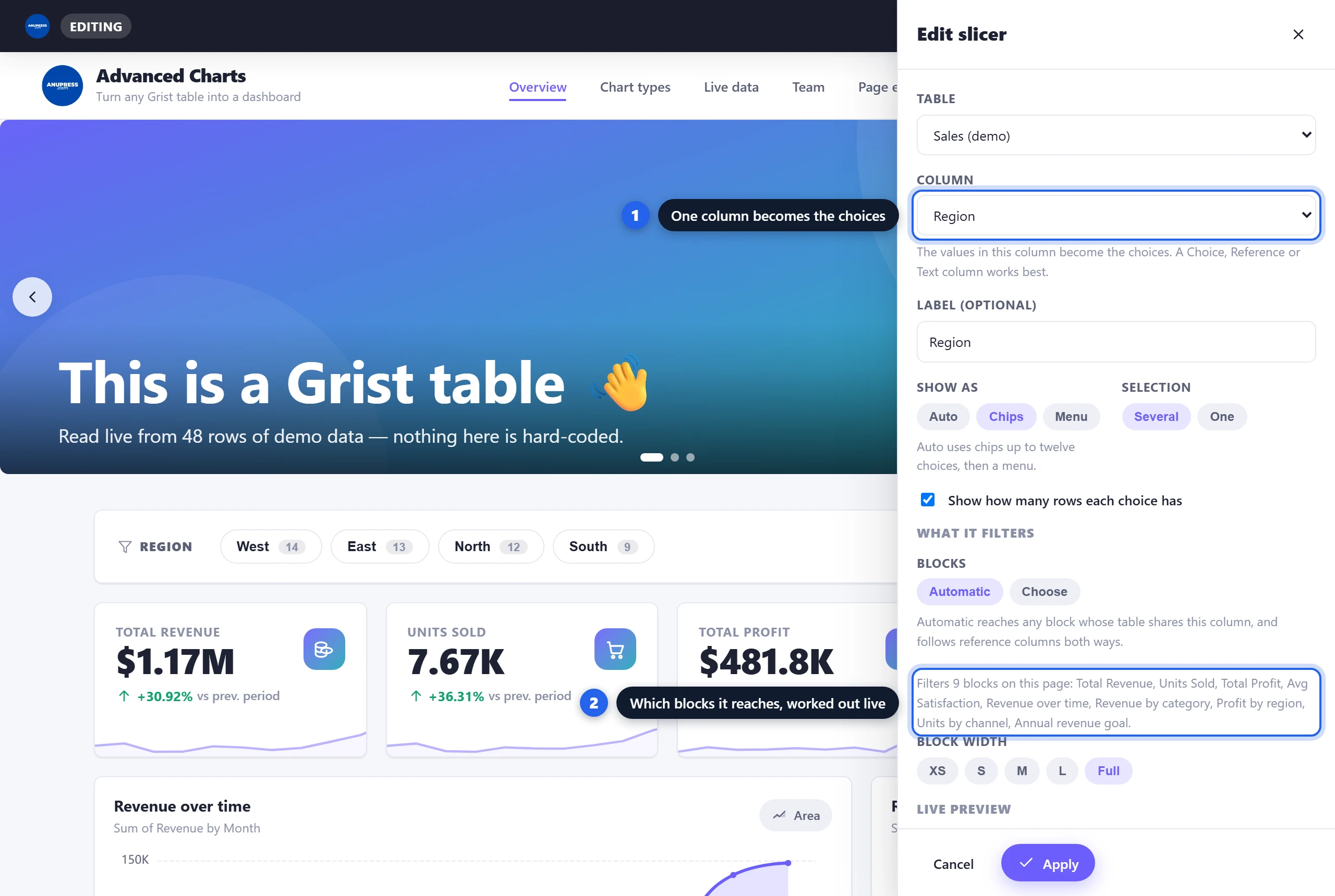
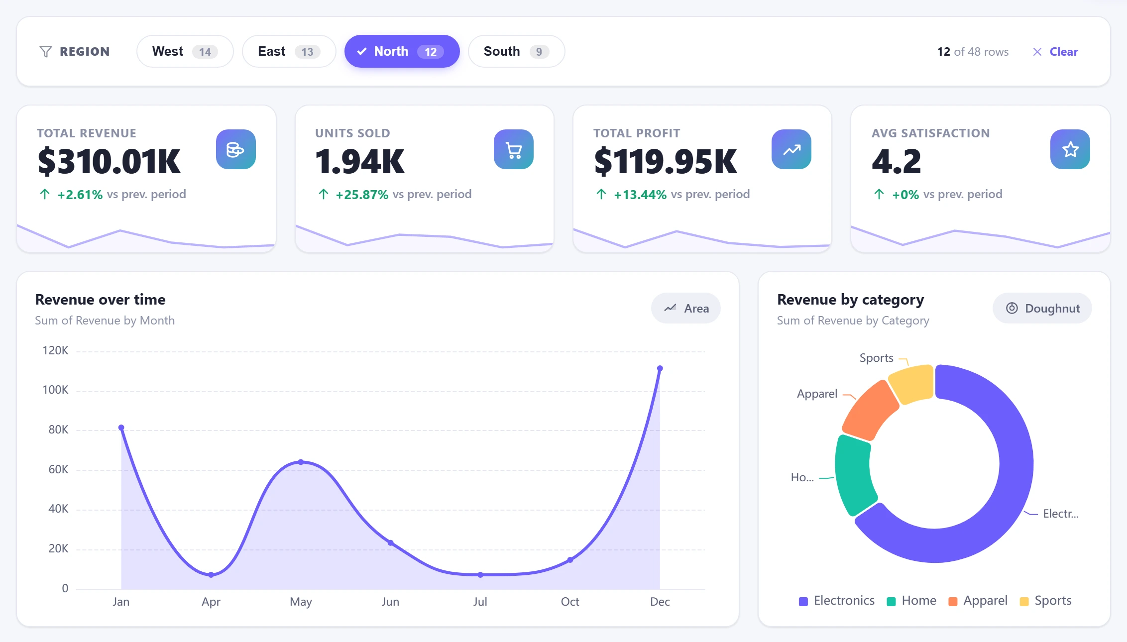
One column’s values as a row of chips (or a menu, once there are more than twelve). A reader picks a value and every other block on the page narrows to match: the KPI cards and their trend lines, the charts, the table, the map, the calendar. It is the one block that changes what all the others show, and the reader’s choice is never saved into the design.
Automatic is the interesting setting. A block is filtered if it reads the slicer’s table, a table with a column of the same name, or a table joined to it by a reference column in either direction — the same “select by” idea Grist uses between widgets, so a slicer on Clients narrows every table that points at Clients. The editor prints the answer as you change things (“Filters 9 blocks on this page: …”), and Choose is there for when the rules are not what you meant, say a chart that should stay whole as context while the rest narrows. Several slicers on one page combine, so Region and Category together show only the rows that match both.
Content blocks
Seven blocks that carry words and pictures rather than metrics — the difference between a wall of charts and a page someone actually reads. This stretch of the Grist tutorial goes faster: these are simpler tools.
10. Text — headings and paragraphs
A heading plus formatted text, for introductions, explanations and context between charts.
11. Image — uploaded, or straight from your data
A photo with an optional caption. The interesting mode is the second one: point it at a Grist Attachments column and a specific row, and the image comes out of your document — a product photo, a headshot, a site plan.
12. Counter — a number that counts up
The classic “1,250+ happy customers” effect: a number animates from start to end when it scrolls into view. The values are typed in, not calculated — for computed numbers use a stat card.
Visitors whose systems ask for reduced motion see the finished number, no animation.
13. Testimonials — quotes with stars
A grid of quote cards: name, quote, star rating, optional photo. Type them in, or — the better trick — read them from a feedback table so new reviews appear on their own.
14. Accordion — questions that expand
A list of questions that open to reveal answers. Made for FAQ sections, works for anything long that shouldn’t fill the page by default.
15. Timeline — dated milestones
A vertical line of events, each with a date, a title and a short description. A history, a roadmap, a process — anything with an order.
16. Pricing table — plans side by side
Plan cards with a price, a feature list and a button each. One plan can be highlighted as the recommended pick.
Basic elements
The quickest section of the Grist tutorial: the small blocks that do layout and utility jobs. None of them read data on the page, and all of them earn their place.
17. Button — a call to action
18. Icon — one symbol in a badge
A standalone icon in a coloured badge, from the same 509-icon library the stat card uses. Decorative on its own, or clickable with a link.
19–20. Spacer & Divider — breathing room
The spacer is invisible vertical space; the divider is a thin rule. Between them they turn one long scroll into visible sections.
21. Countdown timer — a deadline that ticks
Days, hours, minutes and seconds to a date you set, ticking live in the visitor’s browser. Grant deadlines, launches, registration cut-offs.
22. QR code — scan to open
A scannable code for any link or text, generated entirely in the browser — nothing is sent anywhere to make it. Put one on a printed report so paper leads back to the live page.
23. Barcode — a code that prints at a real size
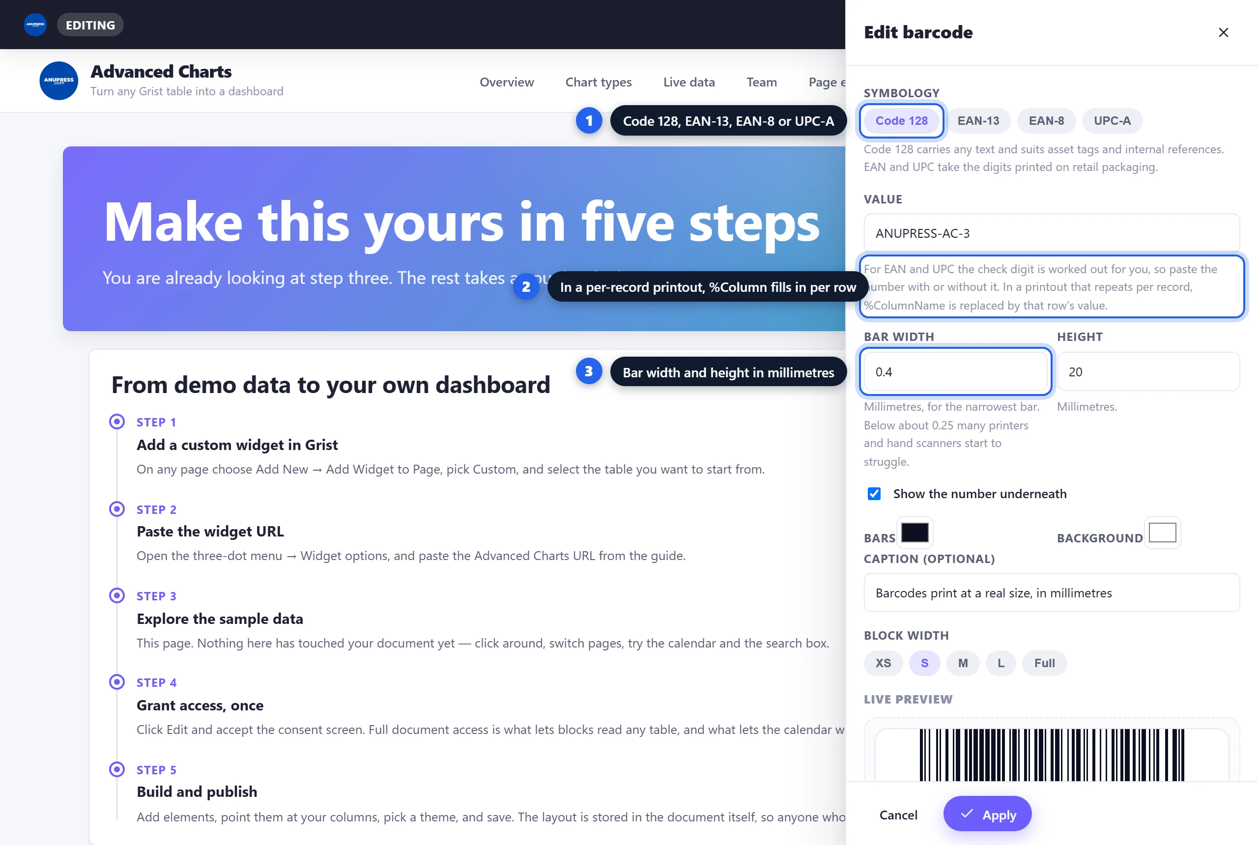
The QR code’s linear cousin: Code 128 for any text (asset tags, internal references), or EAN-13, EAN-8 and UPC-A for the digits on retail packaging. Drawn in the browser like the QR code, but sized in millimetres, because a scanner reads bar widths against the narrowest one and a barcode the browser scaled to fit its column is a barcode that no longer scans. It overflows visibly instead.
The live preview says what it will print at (“Code 128 · prints 79.2mm wide by 20mm tall” for the demo
value at 0.4 mm), so you can check it against the label before you buy the labels. Write %ColumnName in the value or
caption and the block becomes a template: in a printout set to repeat once per row, every copy carries
that row’s value, which is how one block turns into a sheet of product labels.
24. Grid — a panel with its own rows and columns
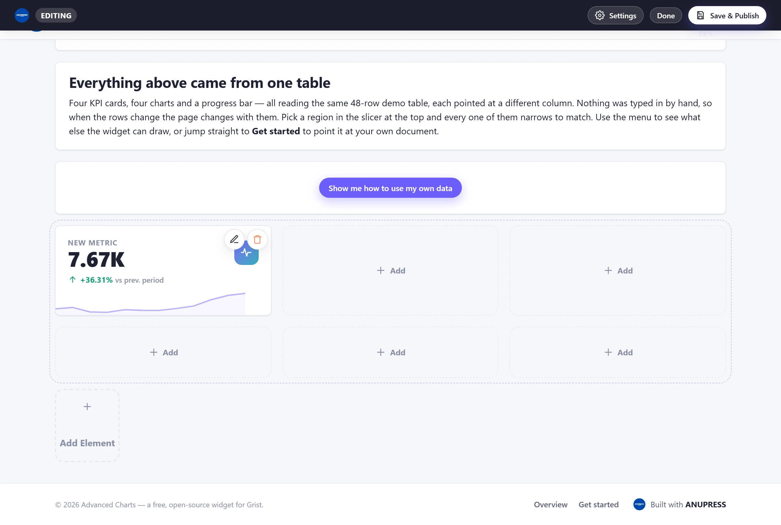
The one block that holds other blocks. Pick columns and rows, one to four each, and every cell can take a block: four small stat cards in one panel, a chart beside its notes, a 3×3 of icons. The panel moves, resizes and prints as one, and a slicer on the page reaches the blocks inside it as if they stood on the page.
The quickest way to a grid is the layout row at the top of Add Section: pick 1×2 and the chooser opens for the first cell at once. Blocks go in from the page rather than from this panel: every empty cell has an Add button that opens the usual chooser, minus the grid itself, since a grid cannot hold another grid. A block in a cell is edited by clicking it and deleted with its bin icon, which leaves the cell empty rather than closing it up. Click the grid’s edge or its title to edit the grid. Shrinking it keeps each block in its row and column where both still exist, moves the rest into free cells, and says how many would be removed before you apply.
Advanced
25. HTML/CSS/JS — the escape hatch
The escape hatch. For the one thing no block covers: write your own HTML, CSS and JavaScript. By default it runs in a sandboxed frame that cannot read your Grist data or the widget’s settings, so a pasted snippet can’t become a data leak. The frame can be up to 4000 pixels tall, so a whole form or a long page shows at its real height instead of scrolling inside a box.
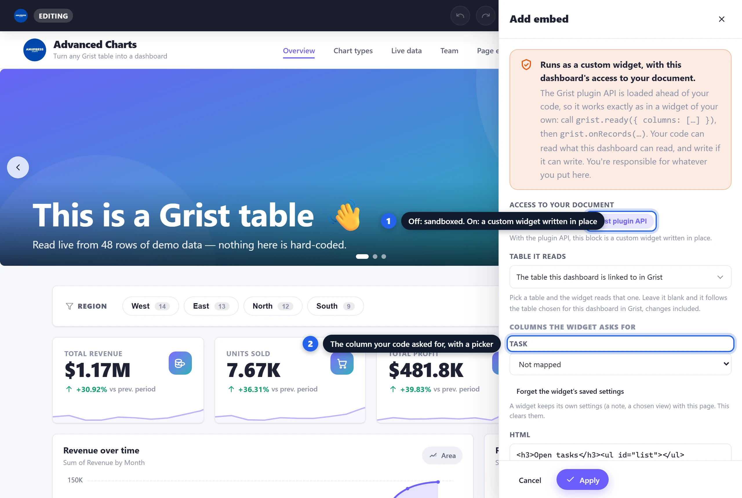
Switch Access to your document to Grist plugin API and the block becomes a custom widget
written in place: the plugin API is loaded ahead of your code, so grist.ready({ columns: […] })
and grist.onRecords(…) work exactly as they would in a widget you host yourself. The editor
then shows the same Table it reads list and column pickers as the Widget block
below, and the note at the top says plainly that your code now has this dashboard’s access.
26. Widget — another custom widget, inside this one
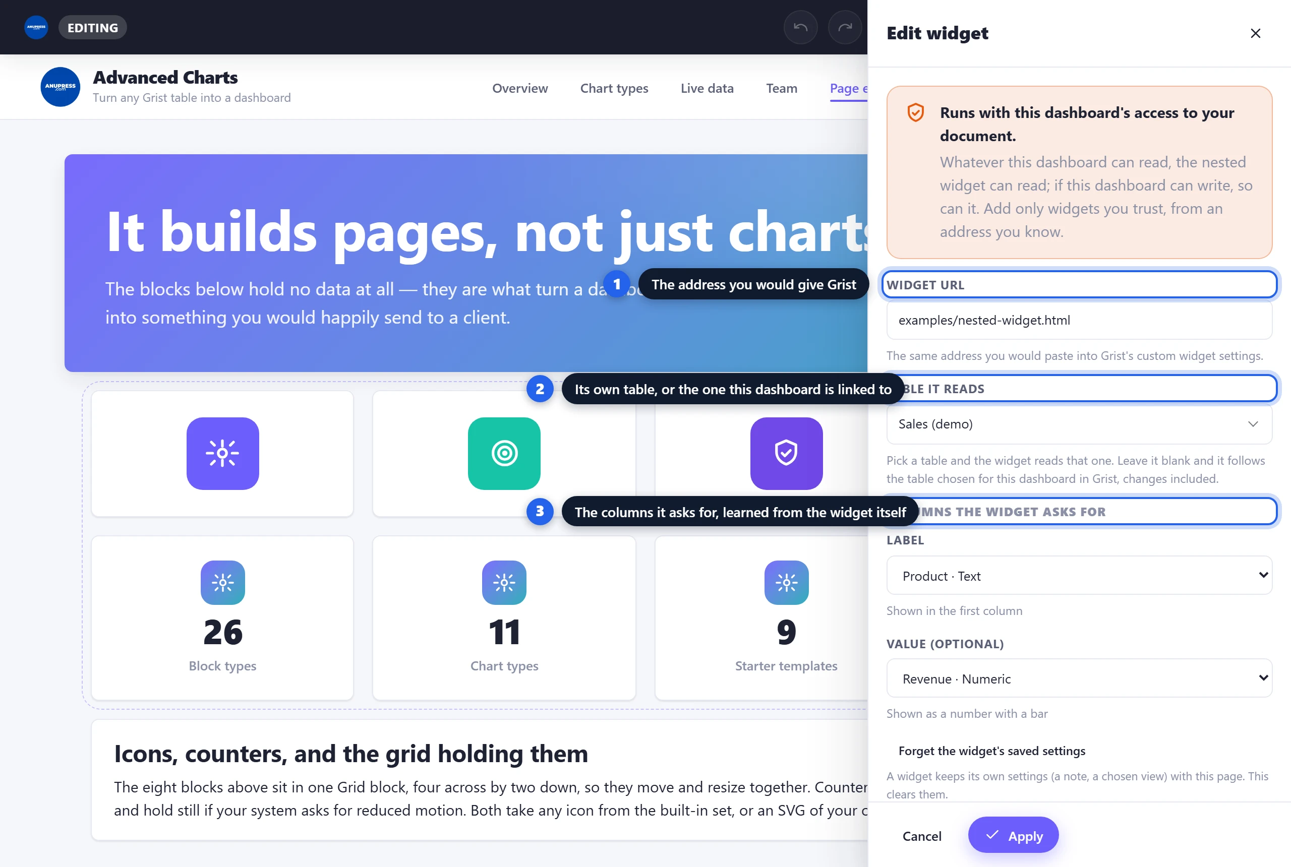
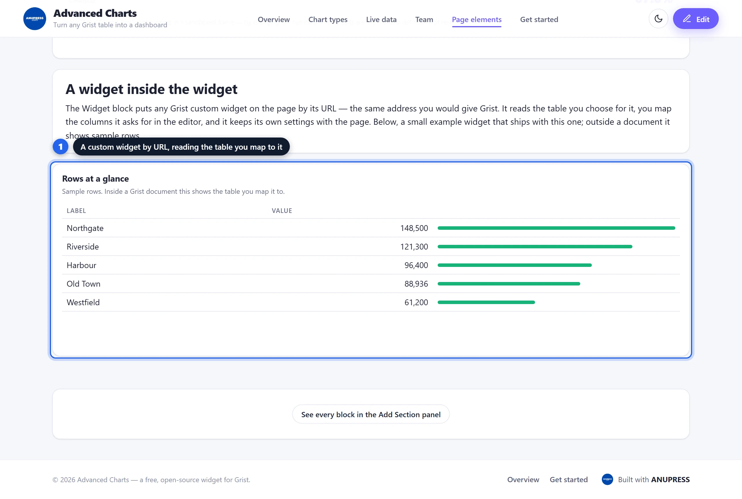
The last stop in this Grist tutorial. Any custom widget you could give Grist, you can now give this page: paste its URL and it runs inside the dashboard, reading your document through this widget. Grist still sees one widget; the calls the nested one makes are carried up and its answers carried back, with its own settings kept under a key of their own so they never collide with the design.
Two choices matter. Table it reads: pick a table and the widget reads that one; leave it blank and it follows the table this dashboard is linked to in Grist, with live change notifications. Columns the widget asks for: when the widget loads in the live preview it says which columns it needs, and each one appears with a picker, the same mapping step Grist shows in its own panel. A required column left unmapped is exactly what the widget would see in Grist, so it shows its own “map the columns” message until you do.
One thing neither this block nor the HTML/CSS/JS block can do is join a printout. An embedded frame lives in its own document and prints as a blank rectangle, so the + that every other block shows in view mode is not offered on these two.
Grist tutorial FAQ
Do I need to know statistics or code?
No. The wizard picks chart types from plain-English questions, impossible combinations grey themselves out, and the only block involving code is optional and labelled Advanced. This Grist tutorial deliberately assumes zero prior knowledge.
Which blocks read my Grist data?
All of the Data & Metrics blocks (stat card, chart, breakdown, map, progress bar, data table, invoice, calendar and slicer) always can, and three Content blocks optionally can: images from an Attachments column, testimonials from a reviews table, and progress bars calculated from a column. Everything else is typed in, though a barcode, QR code or text block can carry %ColumnName placeholders that fill in per row when a printout repeats.
Can I change a block after adding it?
Yes. Hover it in edit mode and click the pencil (or click the block). Apply updates the page, Save & Publish writes it to the document. Delete is the bin icon next to the pencil.
How do block widths work?
Every block has XS–Full widths. Blocks flow into rows left to right: four XS cards share a row, a Full chart takes its own. On phones everything stacks one column wide, whatever you chose.
Can a reader filter the page without editing it?
Yes, with a Slicer block. It shows one column’s values as chips or a menu, and a reader’s choice narrows every other block on the page that reads the same table, shares the column, or is joined to it by a reference column. The choice lives in the reader’s session and is never saved into the design.
Can I put another custom widget inside the dashboard?
Yes, with the Widget block. Paste the widget’s URL, choose the table it reads (or let it follow the table the dashboard is linked to), and map the columns it asks for in the editor. It runs with the same access to your document as the dashboard itself, so nest only widgets you trust. The HTML/CSS/JS block can do the same for code you write in place once its Grist access is switched on.
Where does the sample data in the screenshots come from?
The widget’s built-in demo — a real Grist-style table read live, not mockups. You can poke at everything in this Grist tutorial yourself in the live demo, no account needed.
Keep going
That is the whole Grist tutorial — every block the widget has. Two places to go next: