Turn a Grist table into a website‑style dashboard — no code
Advanced Charts is a free Grist dashboard widget by ANUPRESS. Point it at any Grist table and build a full mini‑site: KPI cards, charts, slicers that let readers filter the page, searchable data tables, invoices, calendars, maps and barcodes, edited in place like a page builder. Install a ready‑made industry template or build block by block. Your data never leaves your Grist document.
No installs, no accounts, and no server in the middle. Advanced Charts is a single URL you paste into Grist. Everything it builds lives inside your own document, and it stays that way.
✦ What’s new in v3.10
- A 42-minute video, start to finish — a coffee roastery’s dashboard built from four CSV files, every step on screen, with the files to follow along. See the video.
- The page follows its data — change the linked table in Grist (a status, a form entry, a teammate’s edit) and the dashboard redraws by itself, on the page you were looking at. See Editing data.
- Numbers in your document’s language (v3.9) — 1.234,56 and “1,17 Mio. €” on a German document, 1,234.56 on an English one, from the locale set in Grist. See Theme.
- Printouts follow the slicers — a printable layout and “Repeat once per record” print the rows
the page’s slicers leave, and a label like
%Product × %Quantityprints the product’s name. See Print. - Data tables and stat cards — columns in the order you pick them and a sort for when the page opens; a unit after a stat card’s number (1,680 kg), whole figures from 1,000 up, and a “vs prev. period” figure that compares the later half of the period with the earlier half. See Stat card and Data table.
- Monthly invoices from a summary table — one row per customer and month is one invoice, and the whole month prints in one run. See Invoice.
- Smaller fixes — Edit opens the page you are looking at; dragging a block follows the pointer, with a mouse, a pen or a finger; a slicer set to Choose takes in blocks added later; a remembered slicer choice stays with its own document and dashboard; map clusters take the theme’s colour; invoices show cents.
- Since v3.8 — Slicers that open already picked and can remember each reader’s last choice, and
Order of groups and Rename groups on charts and breakdowns (
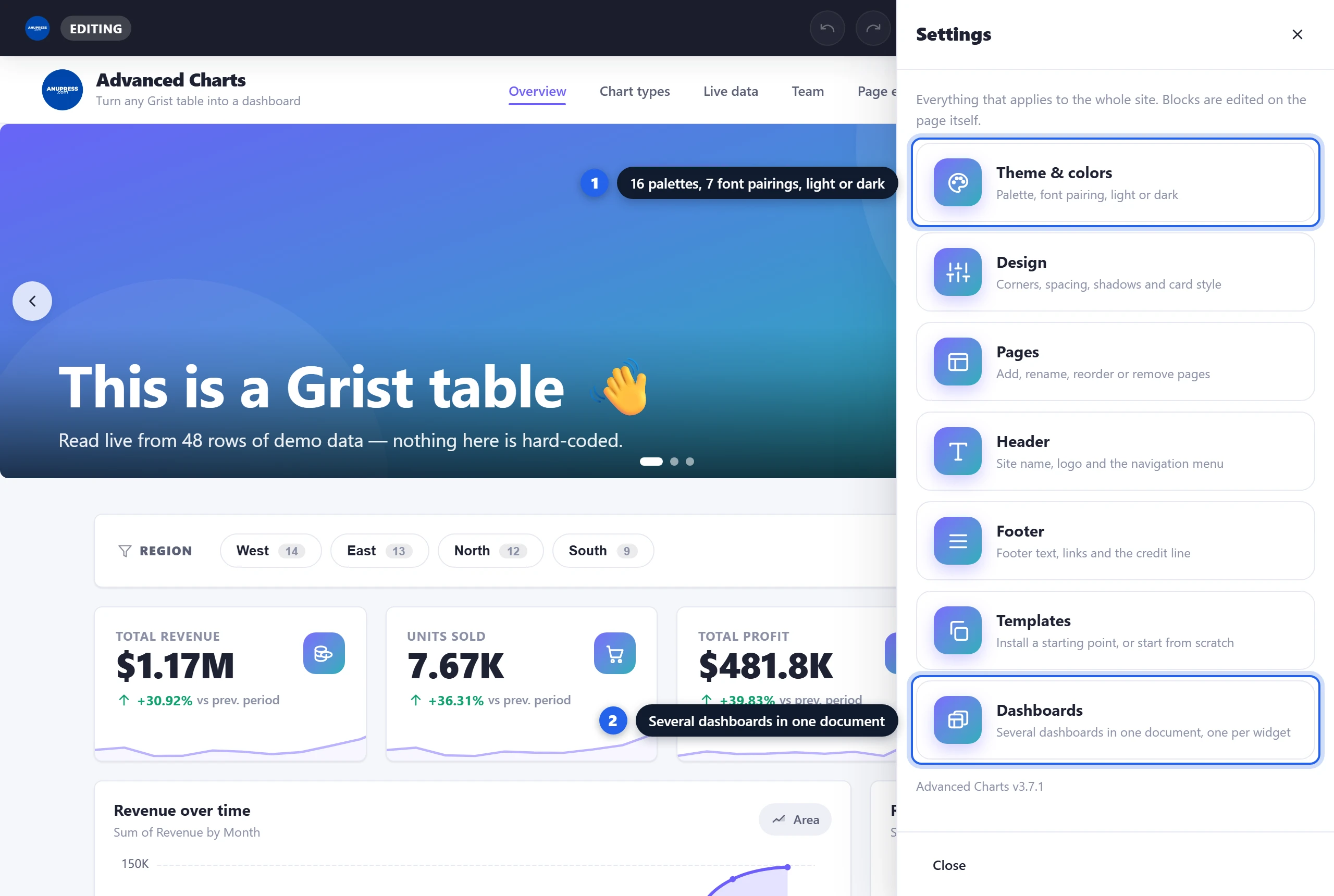
M = Male). See Slicer and Charts. - Since v3.7 — Several dashboards in one document — Operations on one page, Finance on another, each widget showing the one you point it at. Settings → Dashboards makes, switches, renames and deletes them. See Several dashboards.
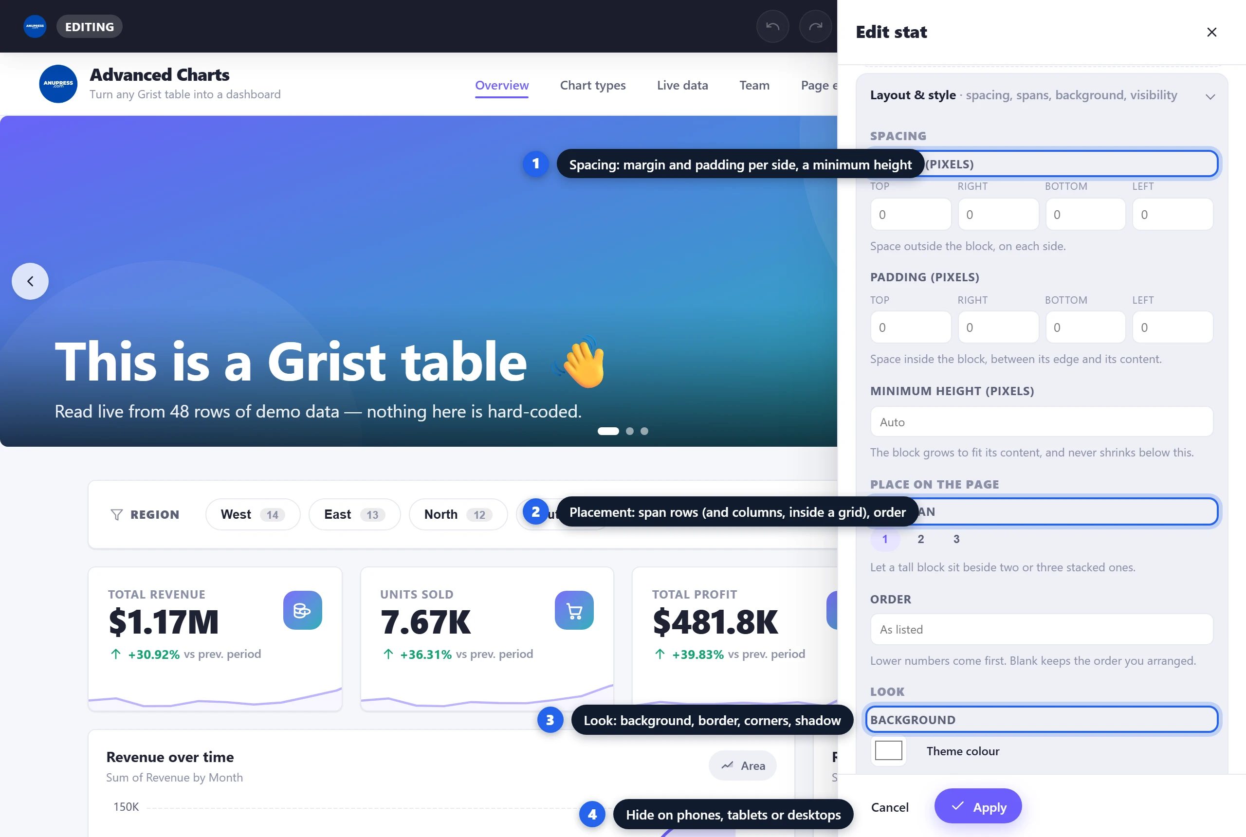
- Since v3.6 — Layout & style on every block — margin and padding per side, a minimum height, row and column spans, order, background, border, corners, shadow, hide on phones or desktops, a CSS id. One collapsible section at the foot of every editor. See The editor.
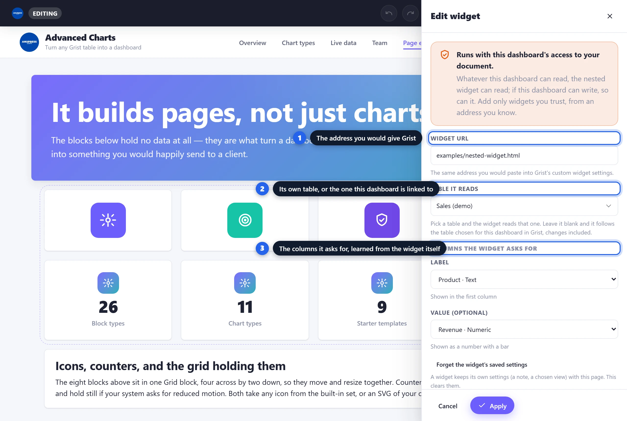
- Widget block — put any other Grist custom widget inside the page by pasting its URL. It reads the table you choose, you map the columns it asks for, and it keeps its own settings. See the other blocks.
- Your own code with Grist access — the HTML/CSS/JS block has a switch that loads the plugin API ahead of your code, so a block can be a custom widget written in place. Off by default.
- Two smaller things — Grist now asks for full document access once, when you paste the URL (it used to ask for read access and leave full to the widget panel), and adding a block to a printout shows where it went: a token flies to the tray and the count bumps.
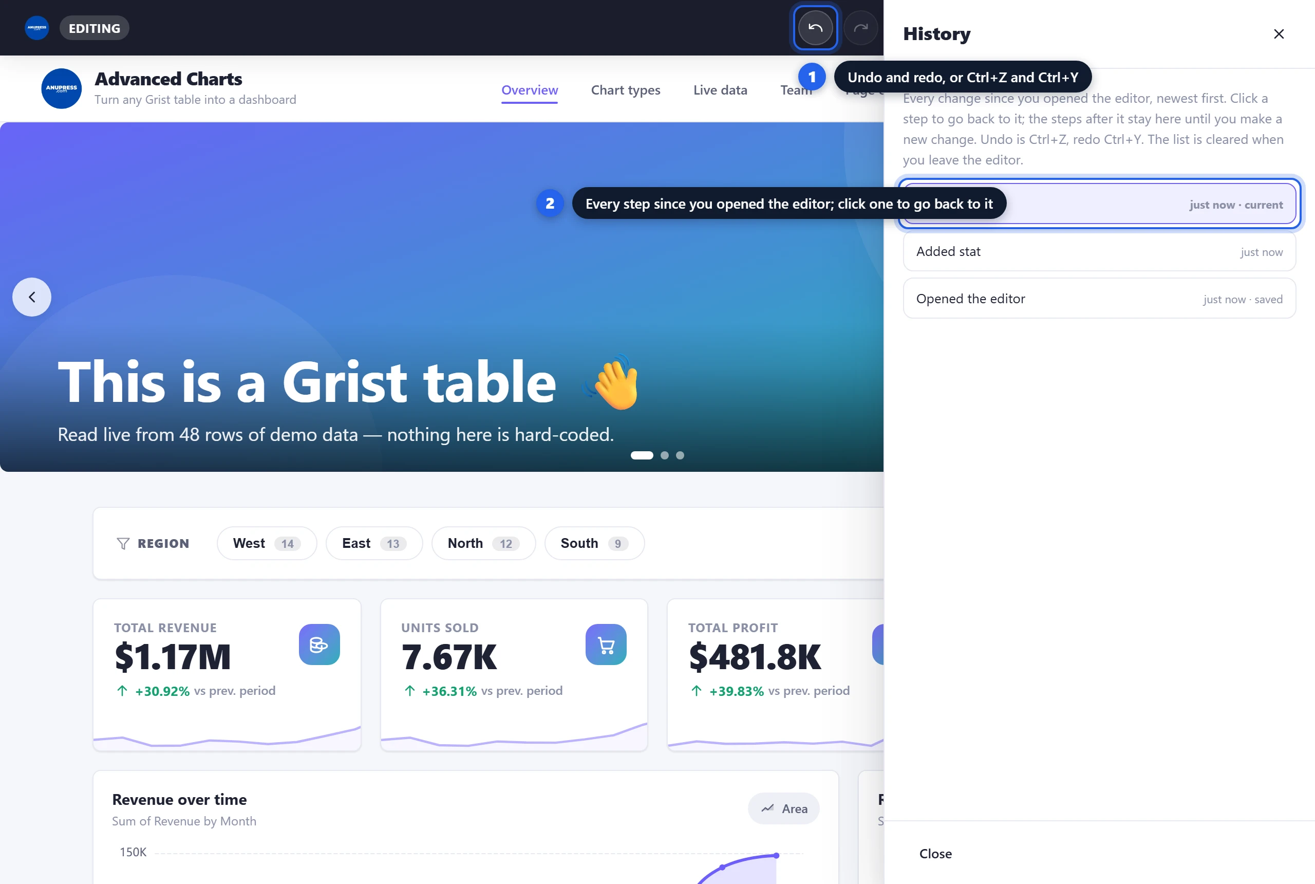
- Since v3.5 — Add Section, undo and history — the tile at the end of a page opens with a row of layouts (a slicer over a chart is three clicks), and the edit bar has undo, redo and a History panel that restores any step of the session. See The editor.
- Grid block — a panel with its own rows and columns, one to four each. Put a block in every cell and the whole panel moves, resizes and prints as one. See the other blocks.
- See the table before you pick it — every “Data table” list now shows a snapshot of the table under the mouse on the left of the page: columns, types and the first rows. See Blocks.
- Slicer block — a row of chips built from one column. A reader picks a value and every KPI card, chart, table, map and calendar on the page narrows to match. Asked for on the Grist community forum as “something closer to a BI tool”. See Slicer.
- Barcode block — Code 128, EAN-13, EAN-8 and UPC-A, drawn in the browser and sized in millimetres so they still scan on paper. See Barcode.
- Print on any page size — four office sizes, four label stocks, or a size you type, with an adjustable margin. A printout can repeat once per record: one barcode becomes a sheet of labels, one invoice becomes every unpaid invoice. See Print.
- Reference columns show what they point at — a client column reads “Meridian Biotech”, not “2”, in tables, charts, breakdowns, calendars and maps. Choice lists and attachments display properly too.
- Since v3.0: a searchable data table, invoices, a drag-to-reschedule calendar, industry templates that install their own sample tables, data editing from the page, a 509-icon library, 16 palettes and 7 font pairings.
What it is & why use it
Grist is a modern spreadsheet‑database. A custom widget is simply a web page you embed inside a Grist document. Advanced Charts is that web page. Instead of showing one chart, it gives you a whole mini‑site: a header with your logo and menu, pages of cards, charts and tables, and a footer.
If you can fill in a form, you can build a dashboard with it. There is nothing to install and no account to create. And you don’t have to start from a blank page: pick a starter template and edit from there.
📊 Every chart type
Bar, column, line, area, pie, doughnut, treemap, funnel, radar, scatter and gauge — powered by Apache ECharts.
🧱 Blocks for the whole page
KPI cards, slicers, data tables, invoices, calendars, maps, barcodes, testimonials, pricing, countdowns, QR codes and more.
🏭 Starter templates
Labs, nonprofits, legal, education, marketing, finance, developers, small business, sports — installed in one click.
🖨️ Print, labels & PDF
Arrange blocks on office paper or label stock, repeat the printout once per record, or print a single invoice or table as a clean report.
🎨 Fully designable
16 palettes, 7 font pairings, dark mode, corners, spacing and shadows — like a page builder.
🔒 Private & free
No ANUPRESS server, no licence, no sign‑up. Everything runs in your browser; your data stays in Grist.
Live, interactive demo
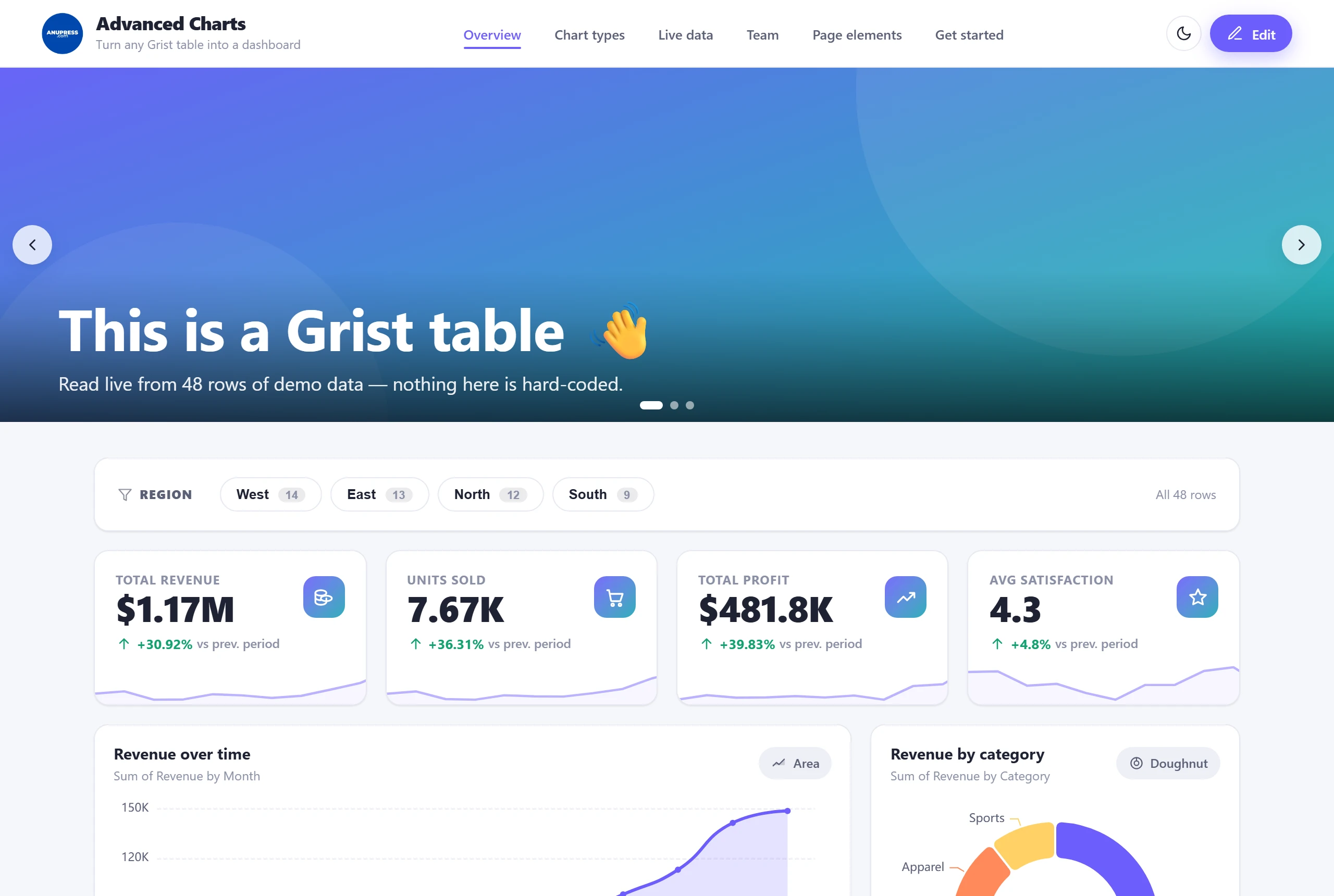
This is the real widget running on sample data — the same thing you’ll get on first load. It cycles through the tabs on its own; click anything to take over and explore. Pick a region in the slicer at the top of the Overview page and watch every card and chart below it narrow. Try the moon/sun icon for dark mode and the Edit button to open the builder (it stays in demo mode here, so nothing is saved).
Watch it built: a real business dashboard, start to finish
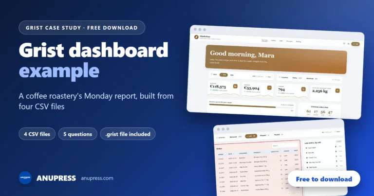
Reading about blocks is one thing; watching a whole dashboard come together is another. This 42‑minute case study builds one for Glutbohne, a small coffee roastery in Berlin (made up, like every number in it): from four CSV files to five pages that answer the five questions the owner used to work out by hand every Monday. Nearly every block in this guide appears in it, at the point a real build needs it.
Chapters: jump to any part
- 0:00 Five questions, one minute
- 0:31 Meet Glutbohne, a coffee roastery
- 1:41 The plan: one question, one block
- 2:48 The data: four CSV files, linked
- 6:33 The shell: widget, theme, five pages
- 11:17 Overview: slicers, numbers, charts
- 16:11 Coffees: the range and the prices
- 20:14 Cafés: a map, and who has gone quiet
- 22:35 This week: roasts and late orders
- 26:06 Packing: a label for every bag
- 28:06 Invoices: a month in one print run
- 32:05 A block of your own, and somebody else’s
- 34:09 A dashboard for the packing team
- 39:06 Monday, after: the dashboard at work
- 41:35 Recap
Along the way: the data set up once, with column types, references and formulas; slicers that reach the right blocks; a map of the cafés and a table that finds the ones that have gone quiet; a roast calendar; barcode labels and a month of café invoices, each printed in one run; a block of your own in HTML, CSS and JavaScript, and Grist’s own pivot table inside the dashboard; a second dashboard for the packing team; and the page on a Monday morning, when a new order turns up by itself.
Quick start: add the Grist dashboard widget in 5 steps
- Open the widget panel in Grist. In your document, add a new widget (or convert a section) and choose the Custom widget type. Grist’s own custom widget docs cover this panel in more detail.
- Paste the URL. In the panel settings, find Enter Custom URL and paste:Grist then asks whether to allow the widget full document access. Accept, and it is settled once: that is what lets it read every table and save your design.
https://anupress.github.io/grist-advanced-charts/ - Look around the demo. The widget loads with sample data so you can see what’s possible before connecting your own.
- Click Edit → Accept. ANUPRESS shows a consent screen (explained below) that says what it writes into your document and what it never does. If you declined Grist’s access prompt in step 2, set Access level to Full document access in the widget panel first.
- Build & publish. Install a starter template, or add blocks yourself — the guided wizard picks a chart type if you’re unsure. Then click Save & Publish. Anyone who opens the document sees your dashboard from then on.
https://anupress.github.io/grist-advanced-charts/?demo=1Permissions & privacy
Every time you click Edit, ANUPRESS shows a short consent screen. It explains, in plain language, exactly what happens next:
- Your design is saved into your document — the layout, colours and logo live in the widget’s own
settings plus a small
ANUPRESS_Configtable, so the dashboard reloads for anyone who opens it. - Your tables are read so you can chart any column from any table.
- Template tables are created only when you ask — installing a template can add its sample tables, each one listed before anything is written.
- Nothing leaves Grist — there is no ANUPRESS server, no analytics, and no third‑party calls.
Grist itself asks you to allow full document access the moment you paste the URL, before anything is read or written. That is required so the widget can read every table (not just one) and save your design. You can change or revoke it any time from the widget panel in Grist, and the consent screen tells you if it is missing.
The editor at a glance
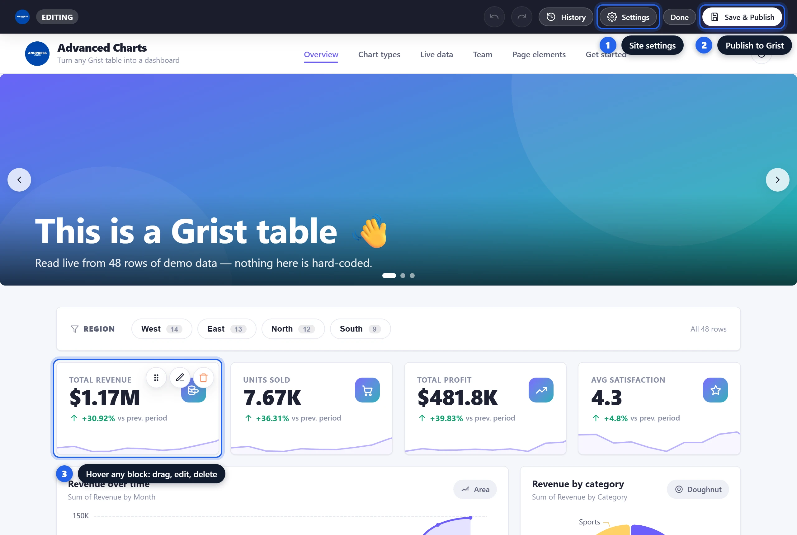
In edit mode a dark bar appears at the top. It has a handful of buttons, and that is the whole surface:
| Button | What it does |
|---|---|
| Undo / Redo | Step back and forward through every change since you opened the editor. Ctrl+Z and Ctrl+Y do the same, and stay out of text fields. |
| History | The same steps as a list, newest first, each named in plain words (“Added slicer to a cell”, “Changed theme”). Click any step to go back to it; the later ones stay until you make a new change. The list is kept while the editor is open and cleared when you leave it. |
| Settings | Everything site‑wide, in one place: Theme & colors, Design, Pages, Header, Footer, Templates and Dashboards. |
| Done | Leave edit mode and return to the live view. |
| Save & Publish | Write your design into your Grist document. |
Blocks are edited on the page itself: hover any block for its drag, edit and delete buttons, or just click it to open its editor. Click the header, footer or hero to edit those directly. An Add Section tile sits at the end of every page.
Every block’s editor ends with the same collapsible Layout & style section, and it is where the fiddly placement work happens. Spacing is margin and padding for each side and a minimum height. Place on the page lets a tall block span two or three rows beside stacked ones, or sets an order; inside a Grid it becomes column span, row span and where the block sits in its cell. Look is background, border, corner radius and shadow. Visibility hides the block on phones, tablets or desktops, and while you edit a hidden block stays on screen, faded and labelled, so you can still reach it. Advanced holds a CSS id, classes and a z-index. Nothing here touches the block’s own settings; Reset clears it all, and undo brings it back.
The building blocks
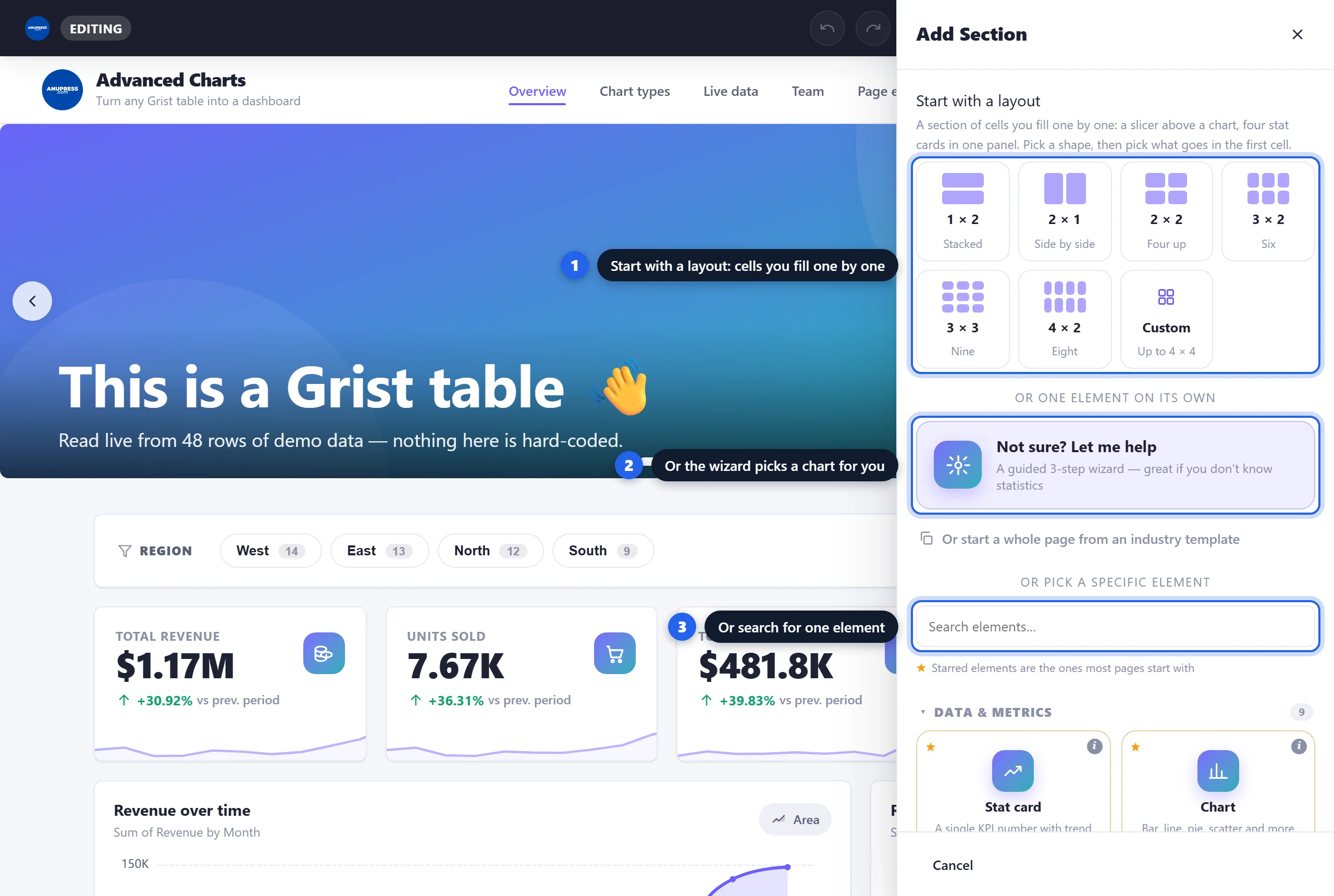
The body of every page is a grid of blocks. Click Add Section and the panel opens with two ways in. At the top is a row of layouts: 1×2, 2×1, 2×2, 3×2, 3×3, 4×2 or custom. Pick one and a Grid block lands on the page with the chooser already open for its first cell, so a slicer above a chart is three clicks. Below the layouts is the single-element list, grouped so it’s easy to scan: Data & Metrics, Content, Basic Elements and Advanced. Starred entries are the ones most pages start with, a search box filters the list, and every block opens a side panel with a live preview, so you see the result while you change settings. Each block also has its own width setting, from a quarter‑width card to the full row. This page covers the blocks you’ll use first; the block-by-block tutorial documents every one of them, setting by setting.
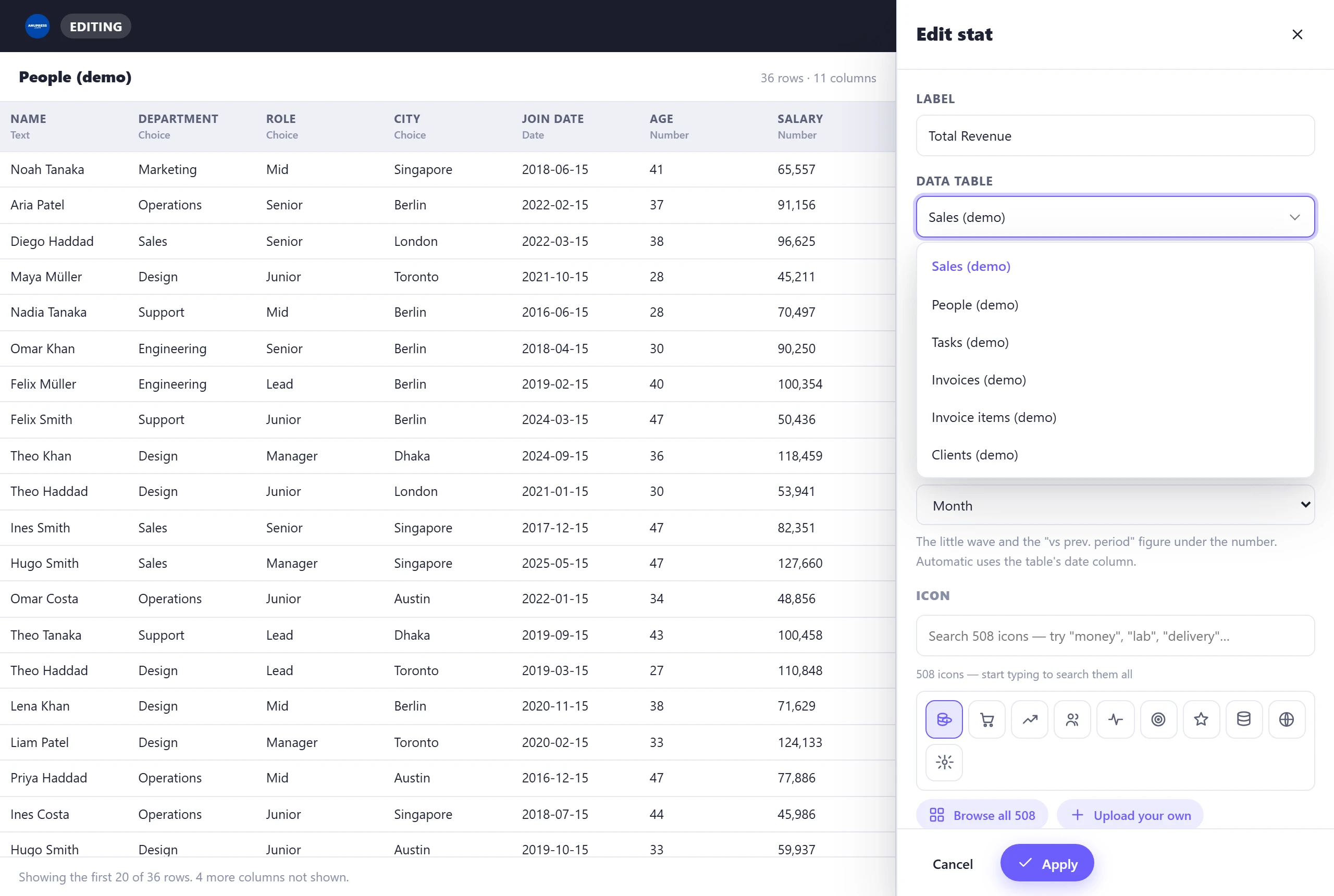
Every data block starts with a table, and the table list shows you what you are choosing. Hover a name, or arrow onto it, and the whole space beside the editor fills with that table: its columns with their types, as many rows as fit with references resolved to names, and a line saying how much is not shown. It takes no clicks, so the mouse can pass over it. The same glance is there in the guided wizard’s first step and in a template’s table setup.
Not sure what to build? The wizard picks for you
Don’t know statistics? You don’t need to. Just below the layouts in Add Section is “Not sure? Let me help” — a short wizard that asks three plain questions:
- Which data do you want to show? Pick a table.
- What do you want to compare? e.g. Region, Month, Category — this becomes your groups.
- What number do you want to see? Pick a column, or choose “Just count entries”.
It then recommends the best chart type for your columns (marked with a ★), greys out the ones that don’t fit, and shows a live preview before it adds anything to the page.

① Stat card (a single KPI)
A big number with an optional trend and a sparkline — e.g. Total Revenue, Headcount.
- Value column — the column to measure. Every column is listed; text columns are marked
(text). - Summarize by — Sum, Average, Count rows, Count values, Distinct count, Min, Max, Median or Std. deviation. Pick a text column and it switches to counting automatically.
- Trend & sparkline — Automatic uses the table’s date column for the “vs prev. period” figure; pick a different column, or turn it off. The figure sets the later half of the months (or days) in view against the earlier half, so a shop whose orders doubled shows it.
- Icon — search a library of 509 icons as you type, browse the whole set, or upload your own. Everyday words find the common ones: “money” finds coins.
- Number format — compact (1.2K, 3.4M), a currency symbol, and a unit after the number (1,680 kg, 312 cups). A figure of 1,000 or more shows whole, €118,575 rather than €118,574.6.

Revenue, Summarize = Sum, Trend = Month,
Currency = $, Compact on → $1.17M ▲ 30.9% vs prev. period.
② Charts
One Chart block, every chart type inside it. You pick the data first, and incompatible chart types grey out automatically — so you can’t build something that doesn’t make sense.
- Categories — the groups along the axis (e.g.
Region,Month). - Values — the numbers to plot (e.g.
Revenue). Add a second category to split into series: the category you pick first is the axis, the second one the series. - Summarize by — the same aggregations as stat cards.
- Chart type — a grid with a ★ on the recommended type for your columns:
| Type | Best for | Needs |
|---|---|---|
| Column / Bar | Comparing categories | 1 category + 1+ value |
| Line / Area | Trends over time | a date/category + value(s) |
| Pie / Doughnut | Share of a whole | 1 category + 1 value |
| Treemap / Funnel | Composition / stages | 1 category + 1 value |
| Radar | Comparing several measures | several values or categories |
| Scatter | Correlation between two numbers | 2 number columns |
| Gauge | A single value vs a target | 1 number column |
Extra options appear per type: Stack series, Smooth curve and custom colours (or inherit the theme palette). Funnels can also be built stage by stage from separate columns, which keeps them honest when your data isn’t already cumulative.
Age and Salary,
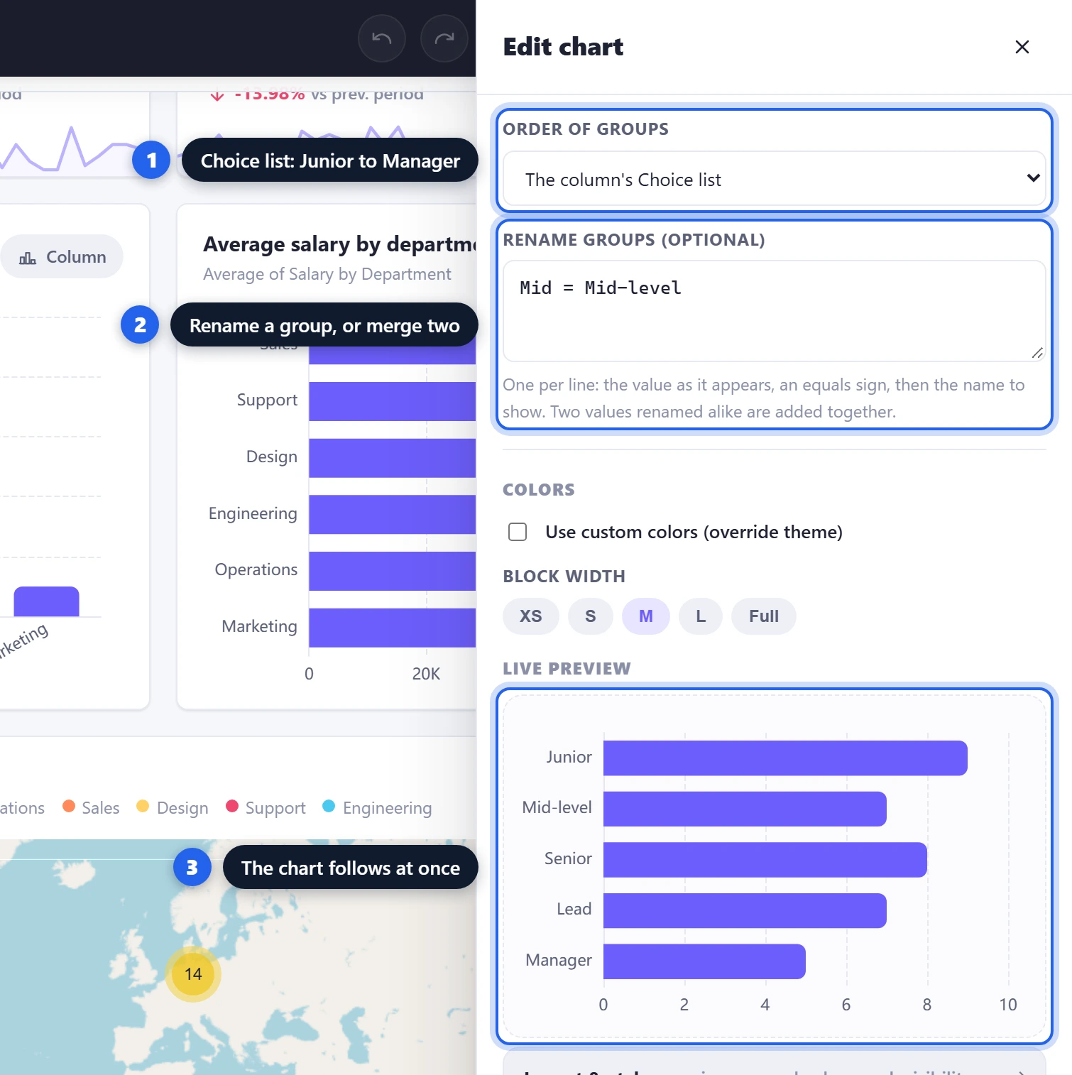
Categories = Department → each point is a person, coloured by department.Order of groups (new in v3.8) decides which group comes first. By default the groups come in the order of the rows, as before. You can also pick Largest first, A to Z, The column’s Choice list or My own order. A to Z puts numbers in numeric order, so 2 comes before 10. With My own order you type one group per line, and any group you leave out follows after them. The Choice list option appears only when the column has a Choice list in Grist. Use it for groups with a natural order, like job levels, because sorting the labels cannot give that order back. A date axis always stays in date order.
Rename groups sits just below it. Write one line per group: the value as it is in your table, an
equals sign, and the name to show, for example M = Male. If two values get the same new
name, they become one group and their numbers are added together. This is also a quick way to merge
categories without a helper column.
③ Breakdown (group‑wise counts)
Counts each distinct value of a column and shows the split with coloured dots, counts and percentages — like “West 14 (29%) · East 13 (27%) · North 12 (25%)”. Empty values get their own row, so it doubles as a quick data‑quality check.
- Group by column — any column.
- Show as — List (the count rows) or a Donut / Pie / Bar / Column chart of the same counts.
- Max rows — anything beyond the limit is rolled into an “Other” row.
- Order of groups and Rename groups — the same two settings as a chart. A breakdown starts with the largest group first.
④ Map (latitude / longitude)
Plots a pin for every row that has coordinates, on an interactive Leaflet map with marker clustering (in the theme’s own colour) and Street / Satellite / Terrain layers.
- Latitude / Longitude columns — auto‑detected by name (e.g.
sample_latitude), or pick them. - Popup title — the bold line in each pin’s popup (e.g. a name or code).
- Colour points by — optional category; the legend lists the colours.
- Tooltip fields — choose up to 4 columns to show in the popup (raw lat/long is never shown).
⑤ Data table
Sometimes a summary is the wrong tool and people just want the rows. The Data table block shows them: searchable, sortable by clicking a column heading, and paged.
- Columns — tick the ones that should appear. They show in the order you tick them, and the editor’s live preview gains or loses the column as you click.
- Sorted when the page opens — any column, ascending or descending: the late orders newest first, or the customers who have gone quiet at the top. Readers can still sort by clicking a heading.
- Highlights — tint a range using spreadsheet‑style references (e.g.
G1:G48), so a column of profits or grades reads at a glance. - Reference columns — a column that points at another table shows the name it points at, and search and sorting work on that name. Reference lists, choice lists and attachments display as readable text or a file count, not as raw ids.
- Print — a data table prints as a clean tabular report, not a screenshot of the widget. See Print, labels & PDF.

⑥ Invoice
Pick a row from your invoices table and this block renders it as a finished document: your details and logo, the client’s address, the line items and the totals, ready to print or save as PDF. It works two ways — a single Amount column on the invoice row, or proper itemisation from a separate line‑items table. Four visual styles ship with it, and it inherits your site’s branding.
Monthly invoices need no invoices table of their own. A Grist summary table of the orders, grouped by customer and month, has one row per invoice, and the block reads it like any other table: it guesses the number, the dates and the amount from the column names, and finds the lines through a text column that holds the invoice number. Add the block to a printout, repeat it once per record, and the whole month prints in one run. The case-study video builds exactly this.

⑦ Calendar
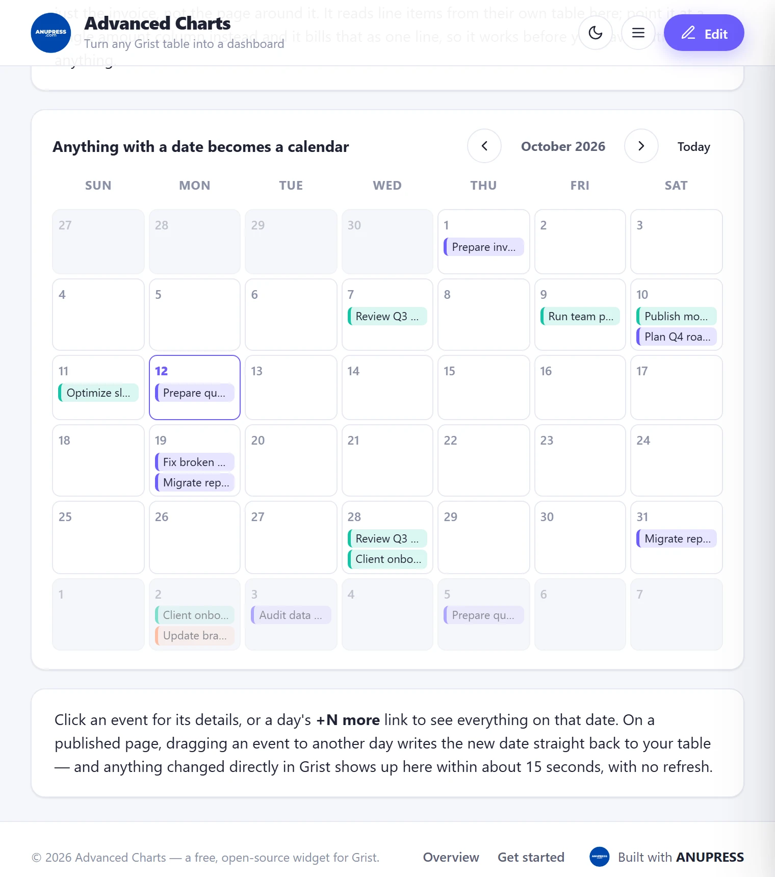
Point it at any table with a date column and every row becomes an event on a month view. On a live document it works in both directions: drag an event to another day and the new date is written back to your Grist table, and edits made in Grist show up on the calendar on their own, without a reload. Click an event for its details, or a day’s “+N more” link for everything on that date. Events can be coloured by a column, such as priority or status. Dates are read and written in the column’s own timezone, so an event logged in Sydney doesn’t drift a day when the dashboard is opened in New York.
⑧ Slicer (new in v3.2)
Every block above answers one question. A slicer lets the reader ask a different one. Pick a column, and the block shows its values as a row of chips (or a menu, once there are more than twelve). Choose North and every KPI card, chart, table, map and calendar on the page narrows to the North rows, trend deltas included. Choose two regions and you get both. Clear it and the page is whole again. The reader’s choice is never written into the design, so nobody can filter a dashboard for everyone else by accident.
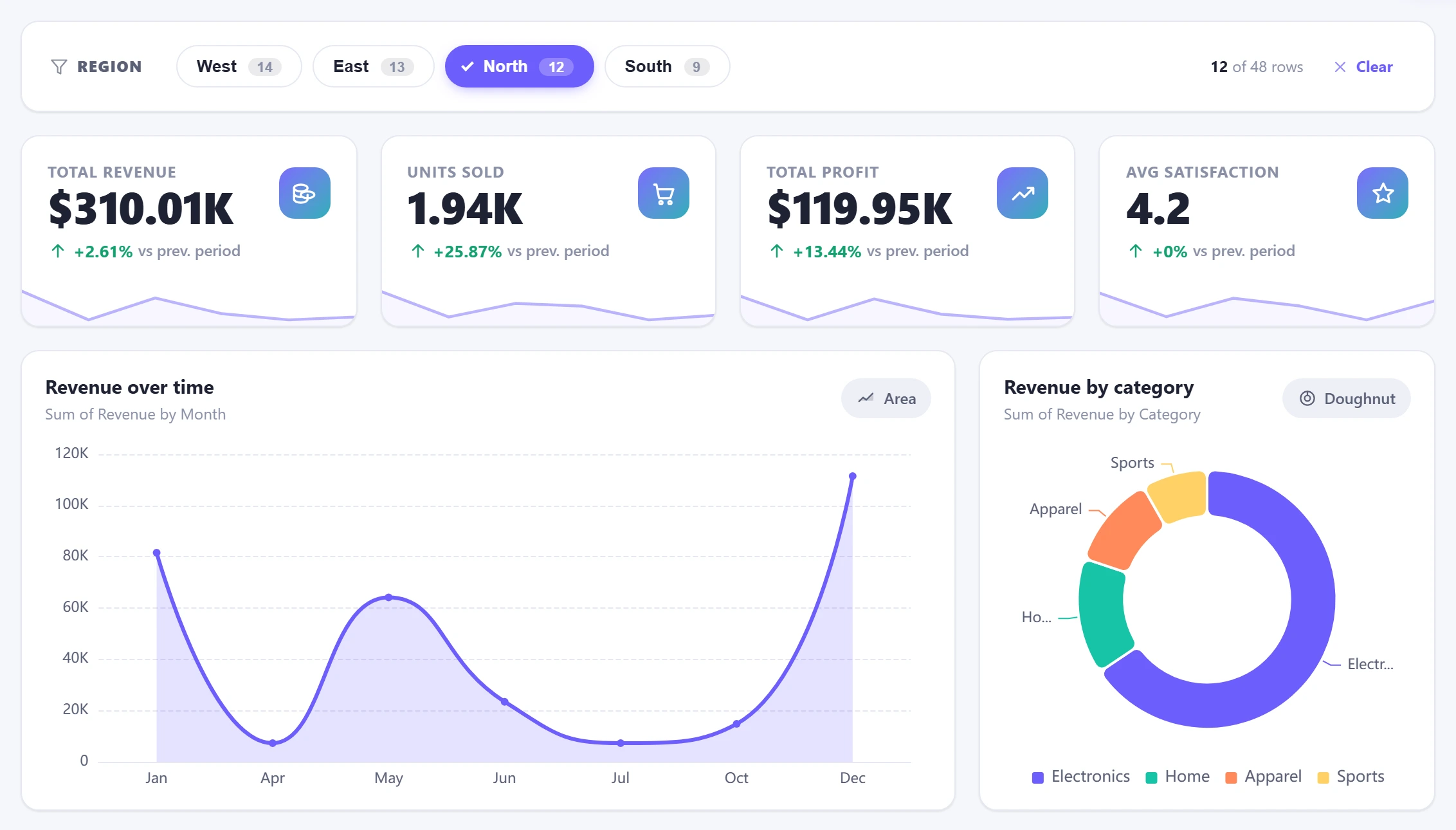
Which blocks a slicer reaches is worked out for you. A block is filtered if it reads the slicer’s table,
a table with a column of the same name, or a table joined to it by a reference column in either
direction. That last rule is Grist’s own “select by”: a slicer on Clients narrows every
table that points at Clients, and a slicer on Invoices by client narrows the clients
table too. Anything else is left whole, and the editor tells you the answer before you save
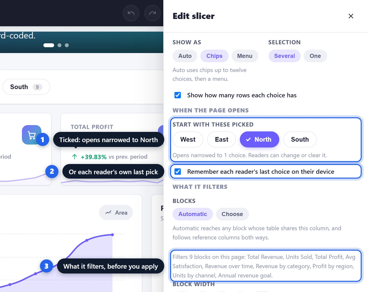
(“Filters 9 blocks on this page: Total Revenue, …”). If the rules pick wrong, switch Blocks to
Choose and tick the ones you mean. A block you add later that the slicer can reach starts ticked
in that list, so a new chart is not left unfiltered by surprise; untick it to leave it out.
- Table and Column — the column’s distinct values become the choices, with a count beside each.
- Show as — Auto, Chips or Menu. Selection — several values, or one at a time.
- Blocks — Automatic, or a checklist of the blocks on this page.
- Several slicers on one page combine: a Region slicer and a Category slicer together show only the rows that match both.
When the page opens (new in v3.8). A slicer can start with some choices already picked. Tick them under Start with these picked in the editor, and the page opens narrowed to them. Readers can still widen or clear the selection. This helps when one master table holds everything but the everyday page needs only part of it, for example this year’s applicants out of all applicants. The editor shows the page with these picks too, so you build against the page your readers will see.
The switch Remember each reader’s last choice on their device keeps what a reader picked, or cleared, in their own browser. The next time they open the page, their choice wins over your defaults. It is stored only in that browser and never in the document, so it does not change the page for anyone else, and it belongs to that document and that dashboard: a copy of the document opens on its own defaults. Also, if a picked value later disappears from the data, the slicer keeps showing it as a dashed chip with a count of 0 (in a menu, it is marked “not in the data now”). That way you can see why the page is empty and untick it.
⑨ Barcode (new in v3.1)
A scannable barcode drawn in the browser, like the QR code beside it, in Code 128 (any text: asset tags, internal references), EAN-13, EAN-8 or UPC-A (the digits on retail packaging). EAN and UPC work out the check digit, so a number pastes in with or without it.
The part that matters is the unit. A barcode is sized in millimetres, not pixels, because a scanner reads a linear barcode by timing bar widths against the narrowest one. A symbol the browser shrank to fit its column is a symbol that no longer scans, so this one keeps its size and overflows visibly instead. The default bar width is 0.33 mm; below about 0.25 mm many printers and hand scanners start to struggle, and the editor says so.
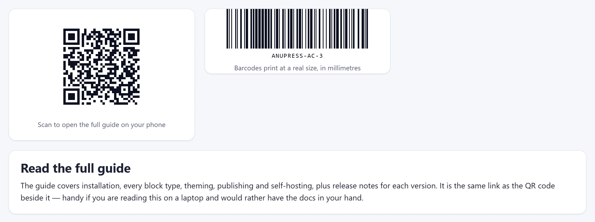
Put %ColumnName in the value and the barcode becomes a template: in a printout that
repeats once per row, each copy carries that row’s value. That is how one block turns into a sheet of
product labels. See Print, labels & PDF.
The other blocks
The rest are the pieces that turn a page of charts into a page someone might actually read:
| Block | What it does |
|---|---|
| Grid | A panel with its own rows and columns, one to four each. Put a block in every cell (any block but another grid) and they move, resize and print as one. Slicers reach inside it. |
| Progress bar | A fill bar toward a goal (“$1.17M of $3M — 39%”), typed in or calculated from a column. |
| Text | A heading and rich text, for introductions and context between charts. |
| Image | Upload a photo, or pull one straight from a Grist Attachments column. |
| Counter | A number that counts up when it scrolls into view (and holds still for reduced-motion users). |
| Testimonials | Quotes with names, star ratings and photos — typed in, or read from a reviews table. |
| Accordion | Expandable questions and answers, ideal for an FAQ. |
| Timeline | A vertical list of dated milestones — a history, roadmap or process. |
| Pricing table | Side-by-side plan cards with features and a call-to-action each. |
| Button | Links to another page of your dashboard or an external URL. |
| Icon | A standalone icon in a coloured badge, decorative or clickable. |
| Spacer / Divider | Blank space, or a thin rule between sections. |
| Countdown timer | Days, hours, minutes and seconds to a deadline, ticking live. |
| QR code | A scannable code for any link or text, generated in the visitor’s browser. |
| HTML/CSS/JS | Your own code. Sandboxed by default, so it cannot touch your Grist data; switch on Grist access and it can use the plugin API like a custom widget written in place. |
| Widget | Any other Grist custom widget, by its URL, running inside the page: it reads the table you pick, you map the columns it asks for, and it keeps its own settings. |
The grid is the one that changes how you lay a page out. The quickest way to one is the layout row at the top of Add Section; the Grid tile in the list does the same with columns and rows chosen by hand. Either way every empty cell shows an Add button that opens the usual chooser. A block in a cell is edited and deleted like any other; the grid itself is edited by clicking its edge or its title. Give it a title and it draws as a card, leave the title empty and only its blocks show.
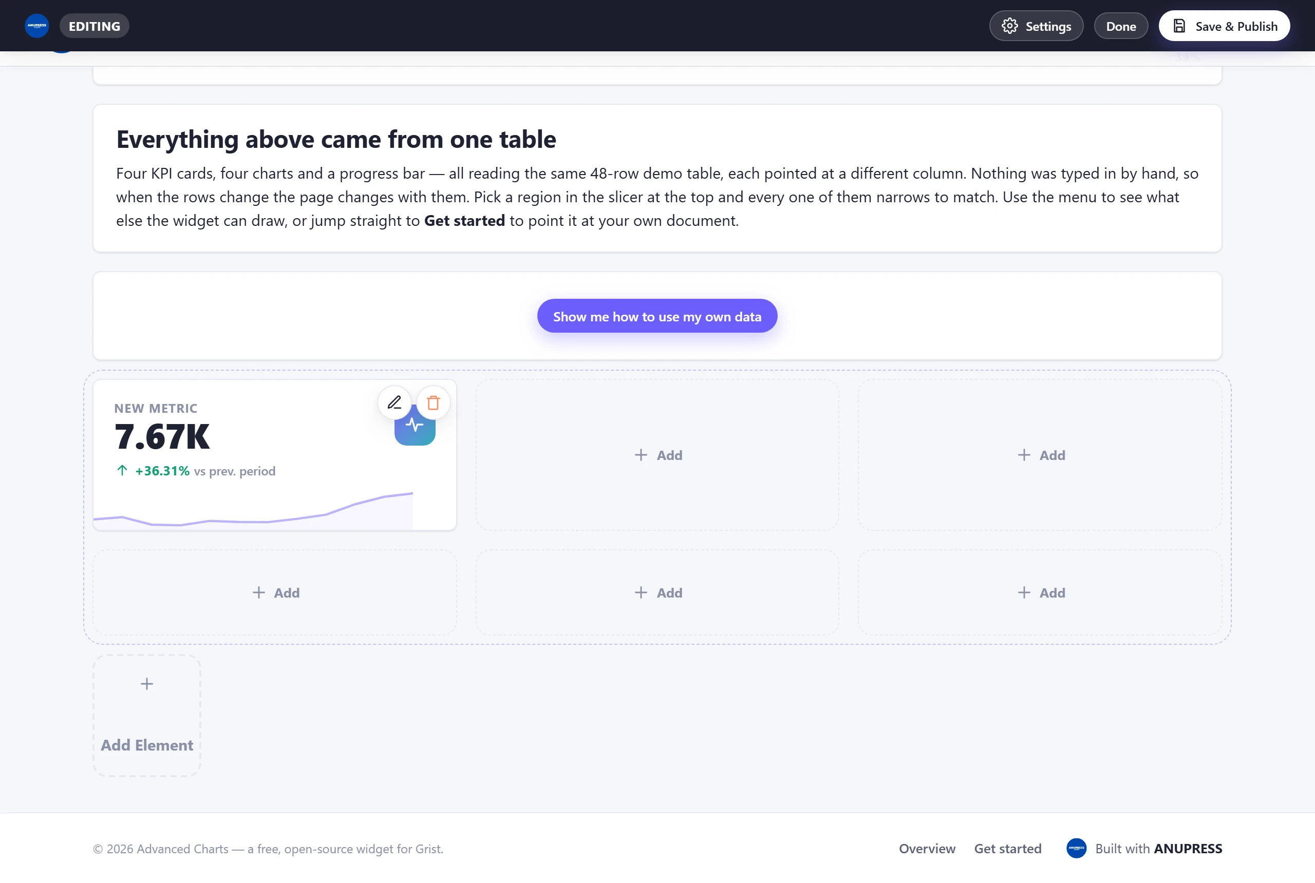
The Widget block is how the page grows past what these blocks do. Paste the URL of any custom widget, the same address you would give Grist, and it runs inside the page with the access this widget has. In the editor you choose the table it reads, or leave that blank and it follows the table this dashboard is linked to in Grist, changes included. When the widget loads in the live preview it says which columns it needs, and each one gets a picker, the same mapping step Grist would show in its own panel. Whatever the widget saves for itself, a note, a chosen view, is kept with the page. The HTML/CSS/JS block has the same table and mapping controls once its Grist access is switched on, which turns a few lines of your own code into a custom widget written in place.
Aggregations in plain English
| Option | Meaning |
|---|---|
| Sum | Adds the numbers up. |
| Average | The mean. |
| Count rows | How many rows there are (works on any column, even text). |
| Count values | How many rows have something in that column. |
| Distinct count | How many different values. |
| Min / Max | Smallest / largest. |
| Median | The middle value. |
| Std. deviation | How spread out the numbers are. |
Starter templates
A blank page is the hardest place to start, so the widget ships ten finished starting points. Each installs a complete multi‑page dashboard (pages, blocks, copy and theme) plus sample tables in your document, so every chart has data from the first second. Then you edit it like anything else, or point its blocks at your own tables.
Open them from Settings → Templates:
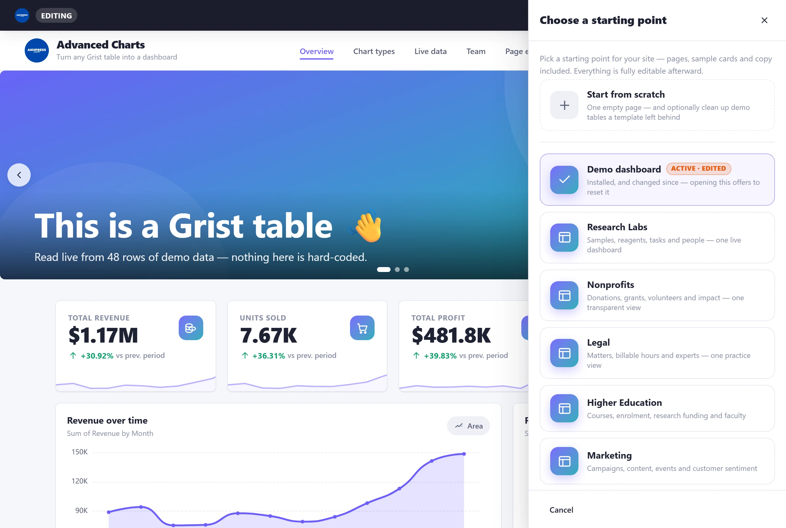
- Research Labs — samples, reagents, tasks and people.
- Nonprofits — donations, grants, volunteers and impact.
- Legal — matters, billable hours, invoices and expert witnesses.
- Higher Education — courses, enrolment, research funding and faculty.
- Marketing — campaigns, content, social, events and customer sentiment.
- Finance & Accounting — invoices, payroll and expenses in one cash view.
- Developers — issues, releases, incidents and uptime on one status page.
- Small Business — pipeline, customers, team and costs.
- Sports Facility — bookings, members, classes and leagues.
- Demo dashboard — the guided tour the widget opens with, reinstallable.
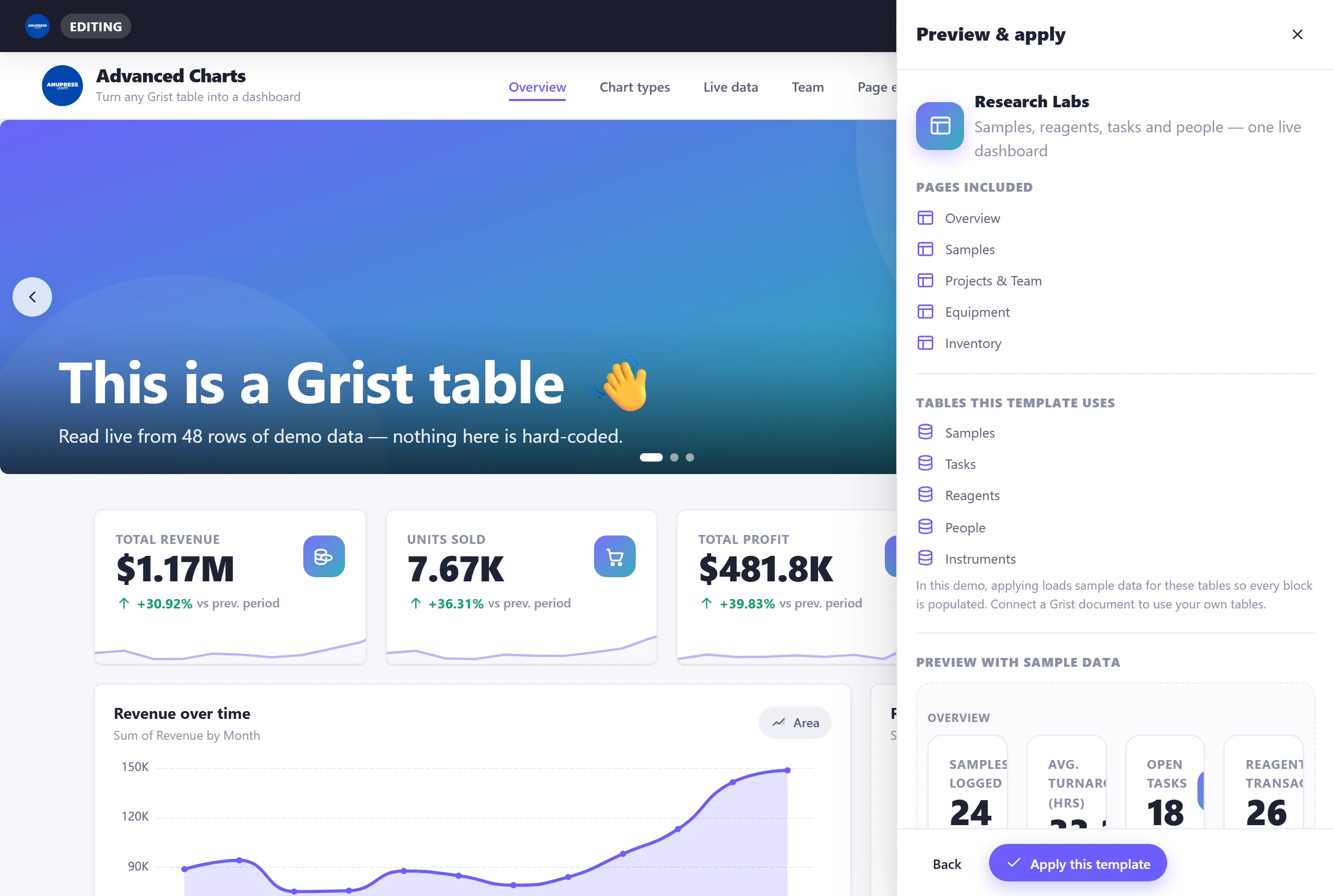
Before anything is applied you get a full preview rendered with that industry’s sample data, a list of the pages included, and a per‑table setup step: for each table the template uses, either let it be created with sample data (the default) or point it at one of your own tables, with a column‑matching step so the blocks know which of your columns is which. Using your own table only reads from it.
Want a closer look at all ten, with screenshots and what’s inside each one? That got its own post:
Editing data without leaving the page
Charts are usually where you notice a wrong number. On a live document, every data block’s editor has an “Edit the data in …” button that opens the table right there: search it, sort it, filter it, correct cells, add rows. Changes are written to your Grist table when you press Save, as a single undoable step, and the block’s preview refreshes so you see the fix land. Columns Grist computes from formulas are shown read‑only, and so are reference, reference list, choice list and attachment columns, because a free-text edit there would send Grist a string where it expects a row id or a list. Each one says which reason applies. Deleting rows deliberately stays in Grist, where the document history lives.
The page follows its data (new in v3.10). When the table the widget is linked to changes in Grist (a status typed in the table next door, a row from a form, a teammate’s edit), the dashboard reads its tables again and redraws by itself, on the same page and at the same place. It waits while the editor, a printout or a calendar popup is open, so nothing moves under your hands.
For everything else there is the Refresh button on live dashboards. It re‑reads every table the page uses, picks up a new column or a table made since the page opened, and shows renamed rows by their new names wherever they are referenced.
Print, labels & PDF (updated in v3.1)
Sooner or later a dashboard has to survive on paper, usually because a board meeting or a client asked. The widget prints three ways, and all three produce documents rather than screenshots:
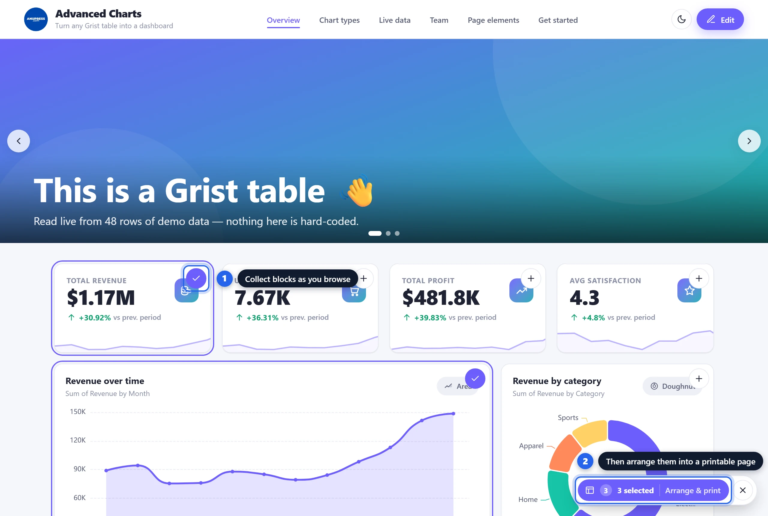
- A printable layout of any blocks you choose. In view mode, every block has an Add to printout button. Collect blocks from any pages, then click Arrange & print: your selection appears on a white sheet with real page‑break guides, you resize and reorder, and print. Tables can be narrowed or capped to fit without changing the page they came from, and every block on the sheet reads its rows through the slicers of the page it came from, so a page narrowed to 41 of 404 rows prints those 41. The two exceptions are the HTML/CSS/JS and Widget blocks: an embedded frame prints as a blank rectangle, so they carry no button.
- A single invoice. The invoice block’s print button prints just the document — the rest of the page is left out.
- A data table as a report. Prints every row as a clean table with the site’s branding, pager removed.
Any page size, including labels
The sheet used to be A4 or US Letter. Now the toolbar offers four office sizes (A4, US Letter, A5, US Legal), four label stocks (business card 85×55, shipping 100×150, address 89×36, small 57×32), and Custom, where you type a width and height in millimetres. The margin is a field too. Label stock arrives with a margin of zero, because a die-cut label has no waste edge to give away; pick office paper again and a normal margin comes back. Preview and paper agree to the millimetre: the sheet on screen is drawn at true paper width, so the page boundaries fall where the printer will really break.
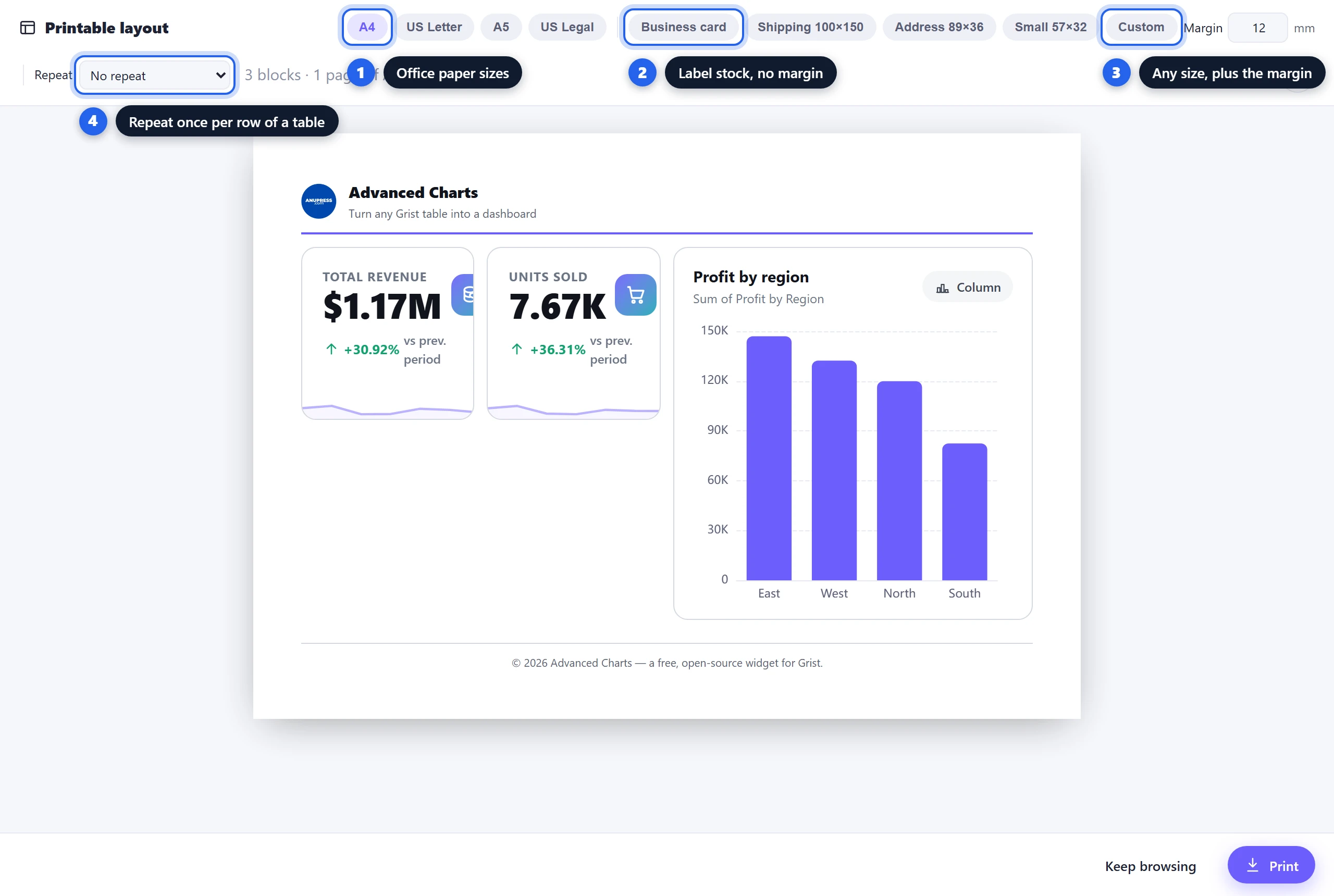
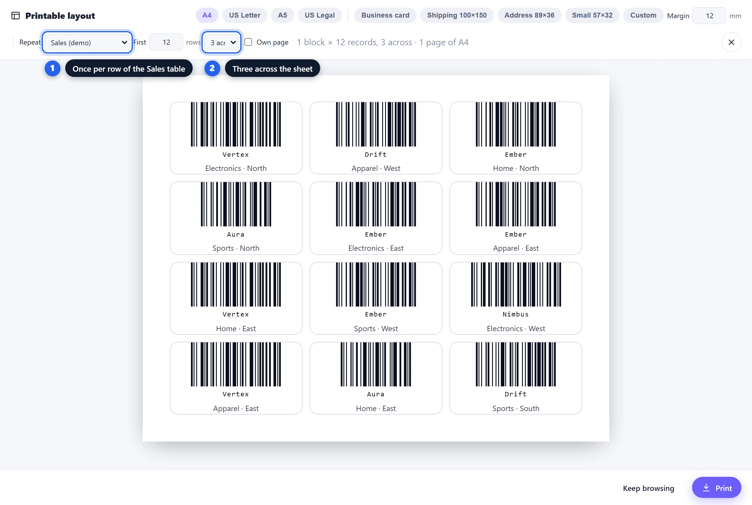
Repeat a printout once per record
Set Repeat to a table and the blocks you collected are printed once for every row of it that the
page’s slicers leave (since v3.10: a packing page narrowed to today’s orders prints a label per order
line of today, not one for every line in the order book), one to six across the sheet or each on its
own page, with a cap on how many rows to take. Blocks that mean something for a single row are rebound
to it: an invoice is told which row it is, and a barcode, QR code or text block with
%ColumnName in it fills in that row’s value, written the way the page shows it, so a
reference reads as its name and a date as a date. A chart of the whole table is left alone rather than
being made to look per-row. Two things this is for: a sheet of product or asset labels from a barcode
block, and every unpaid invoice in one print run.
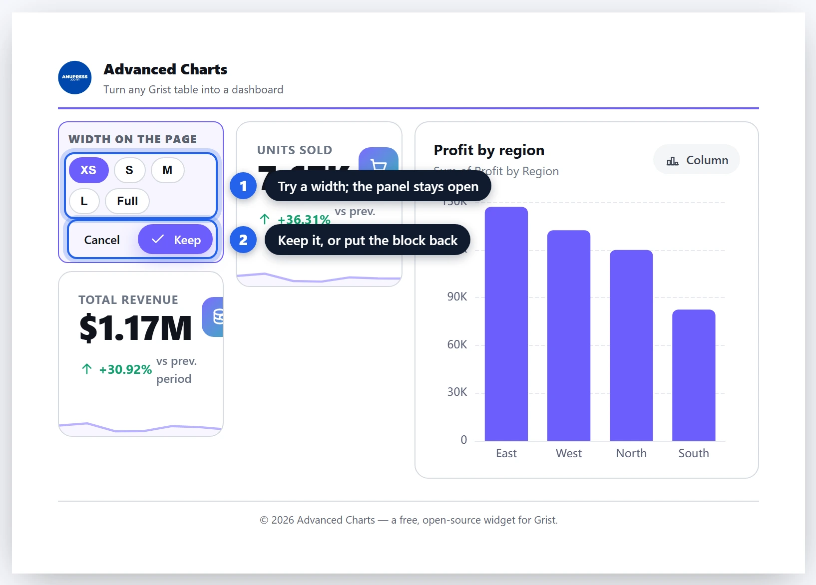
Each block on the sheet has a width control that sits above it, holds open while you try sizes, and closes with Keep or Cancel. Cancel puts the block back exactly as it was.
Dynamic subtitles (write your own, with live numbers)
Every chart, breakdown and map block has a Subtitle field. Type whatever you like, and drop in placeholders that fill in automatically. Click the small (i) next to the field to see which placeholders that block supports.
| Block | Placeholders | Example template → result |
|---|---|---|
| Map | %count %missing %total | %count mapped · %missing without coordinates → “36 mapped · 0 without coordinates” |
| Breakdown | %total %groups %top %topcount %empty | %groups departments → “6 departments” |
| Chart | %count %groups %total | %count rows across %groups groups → “192 rows across 4 groups” |
Hero & slider
Each page can start with a hero — either a gradient banner with your headline, or a full‑width image slideshow. The text is fully designable, WordPress‑style:
Show / hide per page Alignment: left / center / right Vertical: top / middle / bottom Headline size S–XL Font: serif / sans / display / mono Text colour
Add images to turn the banner into a slider, give each slide its own caption, and set auto‑play speed. Edit a hero by clicking it, or from Settings → Pages.
Pages, menu & footer
Your dashboard can have multiple pages (tabs). The menu switches between them instantly, without a reload.
- Add / rename / delete pages, and drag the grip handle to reorder them.
- Per‑page hero — every page has its own headline or slider.
- URL menu links — add external links (label + URL) that appear in the menu and open in a new tab.
- Footer — its text and links are edited from Settings → Footer, or by clicking the footer itself.
Theme & dark mode
- Colour palettes — 16 ready‑made palettes, including a colour‑blind‑safe “Accessible” one; or set your own primary and accent colours. Chart series colours come from the palette too.
- Font pairing — 7 heading/body combinations, from editorial serif to technical monospace.
- Light / Dark — toggle from the Theme panel, or with the moon/sun icon in the header. A viewer’s own choice is remembered on their device, and survives template switches.
- Numbers in your document’s language (new in v3.9) — every figure is written the way the document’s readers write it: 1,234.56 in English, 1.234,56 in German, 1 234,56 in French, with the locale’s own short forms (“1,17 Mio. €”) and the currency symbol where the locale puts it. The widget takes the locale set in Grist under Document settings, so there is nothing to set twice.
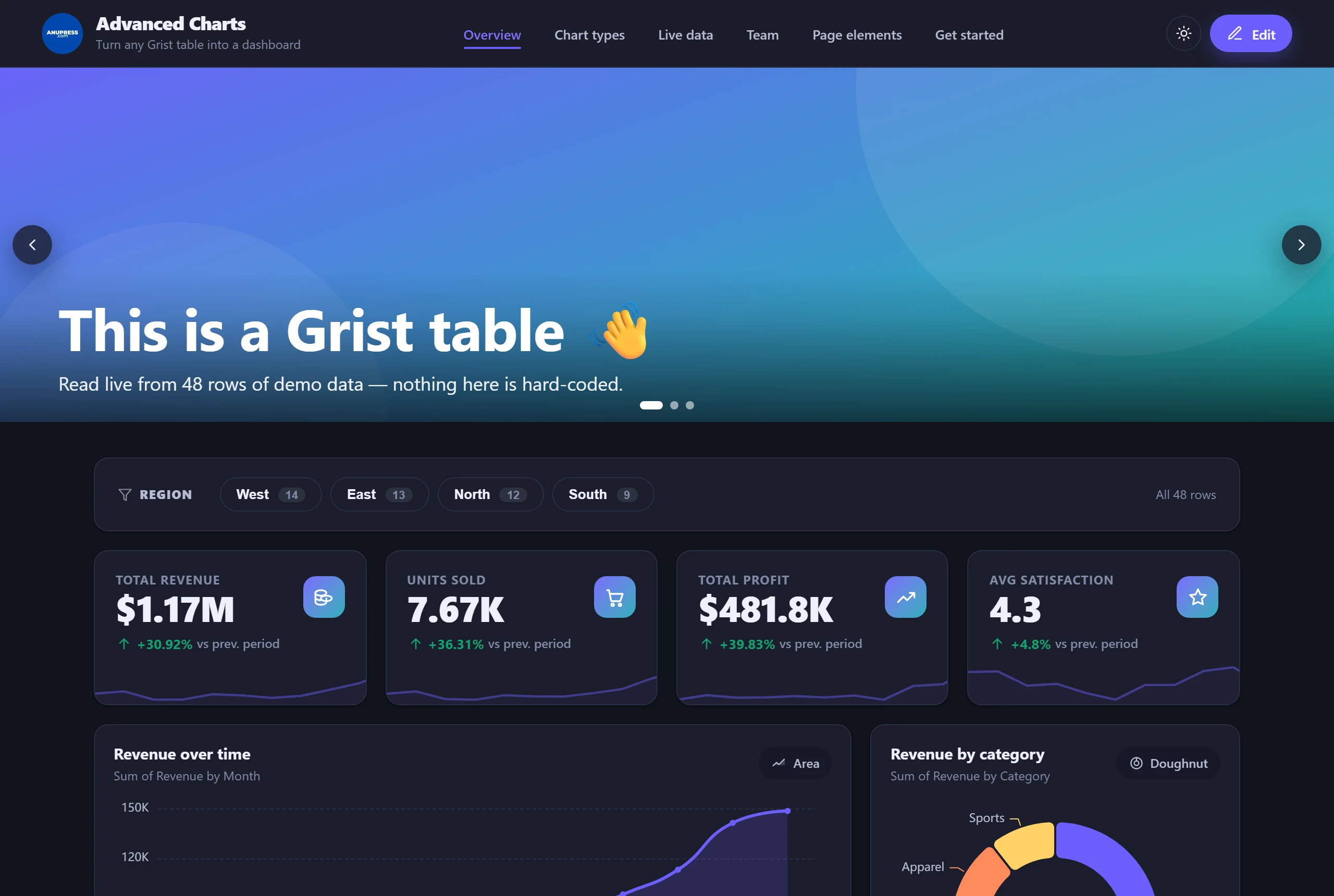
Global design panel
Settings → Design gives you site‑wide controls that apply across both light and dark themes:
Corners: sharp → round Density: compact → roomy Content width: narrow → full Shadows: flat / soft / bold Text size: small / normal / large
Accessibility is part of the design rather than an afterthought: every control in the editor and on the published page works from the keyboard, decorative elements stay silent for screen readers, and animated counters hold still when a visitor’s system asks for reduced motion.
Saving & publishing
Click Save & Publish to write your design into your document — it’s stored in the widget’s own
settings plus a small ANUPRESS_Config table, so it travels with the document and reloads for
anyone who opens it. Applying a template saves immediately on its own, so there’s no window where the
new tables exist but the design doesn’t. Done leaves edit mode.
To wipe the design and start again, use Settings → Templates → Start from scratch. It clears the layout, offers to remove sample tables the widget created (each one listed, nothing else), and leaves your own tables exactly as they were.
Several dashboards in one document
One document can hold more than one dashboard: Operations on one page, Finance on another, a project of
its own on a third. Each widget you add to a Grist page shows one of them, and remembers which. Open
Settings → Dashboards in any widget to see the list, make a new one as a copy of the current
design or as a blank page, point that widget at a different one, rename, or delete. The main dashboard
is the one every document starts with and cannot be deleted. Everything stays in the same
ANUPRESS_Config table, one row per dashboard, so nothing about saving or starting from
scratch changes; those act on whichever dashboard the widget is showing.
Two things guard the dashboards you already have. A widget that has never chosen a dashboard asks, the first time you click Edit in a document that has one, whether to show an existing dashboard or start its own, blank or as a copy; it asks once and remembers. And installing a template into a dashboard that already has a design goes into a new dashboard named after the template by default, with “this one, replacing it” a click away. A template’s table clean-up never lists a table another dashboard reads.
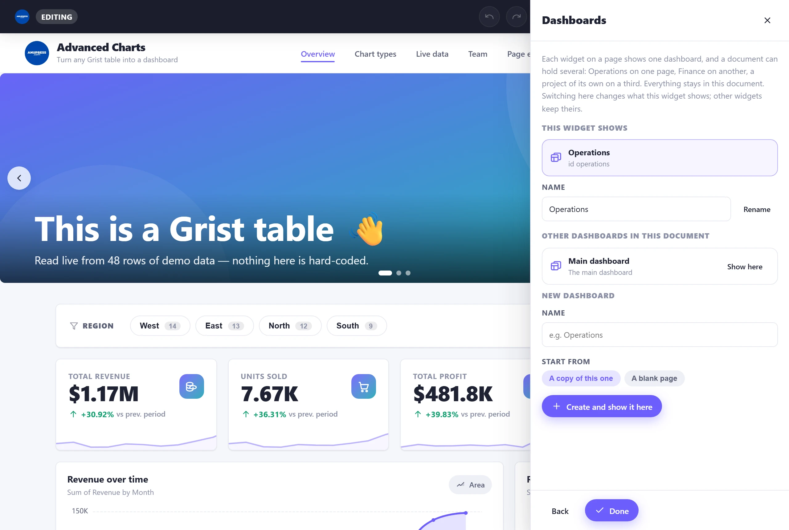
The case-study video does this for a coffee roastery’s packing team: a second widget on its own Grist page, a copy of the main dashboard cut down to the two pages the team uses, its own header and colours, while the main dashboard stays exactly as it was.
FAQ & troubleshooting
Is it really free, and is there a catch?
It’s free and there’s no catch. It’s a static web page you load by URL — no account, no licence, no limits. The only credit is a small “Built with ANUPRESS” link in the footer.
Can ANUPRESS or anyone else see my data?
No. There is no ANUPRESS server. The widget runs entirely in your browser and talks only to your Grist document. The single exception is map tiles (see Permissions & privacy).
Which block types are there?
Four groups. Data & Metrics: stat card, chart, breakdown, map, progress bar, data table, invoice, calendar and slicer. Content: text, image, counter, testimonials, accordion, timeline and pricing table. Basic: button, icon, spacer, divider, countdown, QR code, barcode and grid. Advanced: an HTML/CSS/JS embed, sandboxed or with Grist access, and a Widget block that runs any other custom widget inside the page by its URL.
Can one document have more than one dashboard?
Yes. Each widget you add to a Grist page shows one dashboard and remembers which. Open Settings → Dashboards in a widget to make a new one, as a copy of the current design or as a blank page, and to point that widget at any dashboard in the document. They all live in the same config table, one row each, and the main dashboard is the one every document starts with.
Can readers filter a dashboard without editing it?
Yes. Add a Slicer block and pick a column. Readers get a row of chips or a menu, and choosing a value narrows every other block on the page that reads the same table, shares the column, or is joined to it by a reference column. Their choice is never written into the design. You can also make the page open with some choices already picked.
Can a dashboard open already filtered?
Yes. Open a Slicer block’s editor and tick the choices under Start with these picked. The page then opens narrowed to them, and readers can still widen or clear the selection. Switch on Remember each reader’s last choice on their device to give each reader their own last choice back next time. It is kept in their browser, not in your document.
Does the dashboard update by itself when the data changes?
Yes, for the table the widget is linked to. When a row in it changes in Grist, whether typed in, sent by a form or edited by a teammate, the dashboard reads its tables again and redraws on the page you were looking at. It waits while the editor, a printout or a calendar popup is open. Changes to other tables come in with the Refresh button in the header.
Can the numbers use a decimal comma, like 1.234,56?
Yes. The widget writes numbers in the locale set in Grist under Document settings: 1.234,56 and 1,17 Mio. € for German, 1 234,56 for French, 1,234.56 for English. Stat cards, charts, tables, breakdowns and progress bars all follow it, and Edit data reads 9,50 as nine and a half.
Is there a video that builds a whole dashboard?
Yes. A 42-minute case study builds a coffee roastery’s dashboard in Grist from four CSV files, start to finish, with chapters for every part. It is embedded on this page, and the CSV files and the finished dashboard can be downloaded to follow along.
Which templates are included?
Ten one-click starting points: the demo dashboard plus nine industry templates — research labs, nonprofits, legal, higher education, marketing, finance & accounting, developers, small business and sports facilities. Each installs complete pages with sample tables you can replace with your own. The template library post tours all ten.
Will applying a template delete my data?
No. A template replaces the dashboard design, not your data. The only tables it ever offers to remove are sample tables the widget itself created earlier, listed with checkboxes before anything happens. Your own tables are never touched.
Can I print a dashboard or save it as a PDF?
Yes. Every block has an Add to printout button in view mode. Collect blocks from any page, arrange them on A4, US Letter, A5, US Legal, a label stock or a size you type, and print or save as PDF. A printout can also repeat once per row of a table, which turns one barcode into a sheet of labels or one invoice into every invoice, and it prints only the rows the page’s slicers leave. Data tables print as clean tabular reports and invoice blocks print as single finished documents.
Can it print barcodes and labels?
Yes. The Barcode block makes Code 128, EAN-13, EAN-8 and UPC-A symbols in the browser, sized in millimetres so they still scan after printing. Put %ColumnName in its value, choose a label stock or any page size in the printable layout, and set the printout to repeat once per row of a table.
The column dropdown is empty / my chart has no data.
Check three things: you granted full document access, you selected the correct Data table, and — for charts — that your columns suit the chart type (incompatible types are greyed). Stat cards list every column; text columns are counted rather than summed.
My map is blank.
Make sure the Latitude and Longitude columns hold numbers in valid ranges (lat −90…90, lon −180…180). Rows without both are counted as “without coordinates”.
I don’t know which chart to use — is there help?
Yes. Click Add Section and choose “Not sure? Let me help”. Answer three plain-English questions and Advanced Charts recommends the best chart type and adds it for you. See the wizard.
Does it work on a self‑hosted Grist?
Yes. Any Grist that supports custom widgets by URL works — Grist’s hosted service or your own instance. The widget is a static page with no backend, so it behaves the same on both.
Which version am I on, and how do I update?
Grist loads the widget from our URL every time the document opens, so a new release reaches you on its own. Browsers keep the previous copy for up to ten minutes, so if a fix seems missing, hard-refresh the tab (Ctrl+Shift+R). To see which build you have, click Edit, then Settings: the last line of the panel reads “Advanced Charts v3.10.14” or later. The browser console prints the same line when the widget starts.
How do I update or reset my dashboard?
Click Edit to change it, then Save & Publish. To reset, use Settings → Templates → Start from scratch — it clears the design and offers to clean up any sample tables the widget created, without touching your own.
Request a feature or send feedback
💡 Suggest a feature
Found a bug, or want a new chart type or option? Tell us — this widget grows from real requests. The wizard, the templates and the print layouts all started as one.
About ANUPRESS
ANUPRESS builds practical, no‑nonsense tools and honest reviews for people who run their own sites and data. If you found this useful, you might like our other hands‑on guides: